
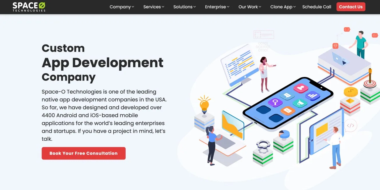
A dated site with confusing services and no clear path to contact.
Lead UX/UI designer over 6 months.
A modern, card-based site on a reusable design system.
Problem
The site looked dated, navigation was unclear and there was no obvious path to conversion. Services were confusing, landing pages had no primary CTA, and visitors struggled to tell mobile, web and app services apart.
Before and after
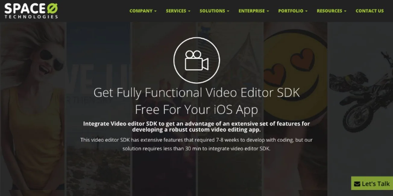
Goals
Look modern and credible, make services and past work easier to find, simplify navigation to cut bounce rate, and generate more leads through CTAs and contact forms.
Competitive analysis
| IndiaNIC | HiddenBrains | Silicon IT Hub | Space-O redesign | |
|---|---|---|---|---|
| Mega menu | ||||
| Quick inquiry form | ||||
| Contact information | ||||
| Recent products | ||||
| Services info | ||||
| Coverage | 3/5 | 3/5 | 3/5 | 5/5 |
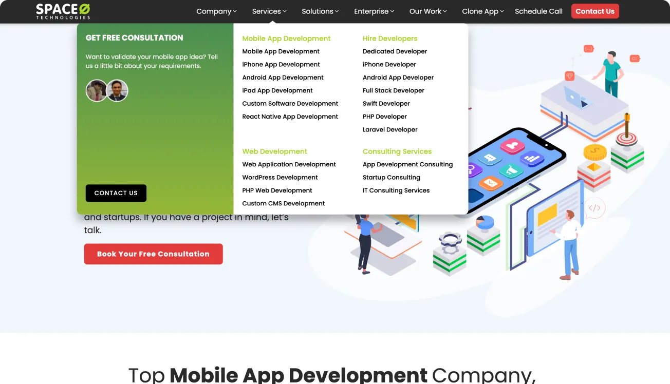
Information architecture
- Company Details
- About
- Who we are
- Leadership team
- Testimonials
- Infrastructure
- Career
- Employee Speaks
- Services
- Mobile App Development
- Web Development
- Consulting Services
- Hire
- Solutions
- Convert into App
- Custom Solutions
- Portfolio
- Contact
Style guide
Colors Click a swatch to copy
Poppins
H1 · BoldH2 · Semi BoldBody · RegularKey sections
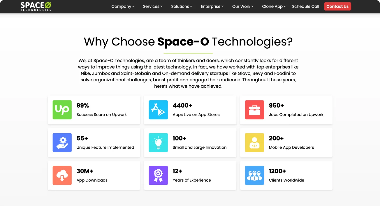
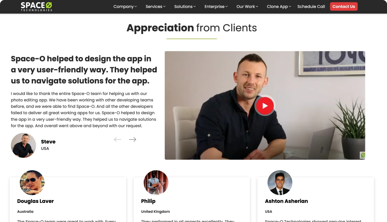
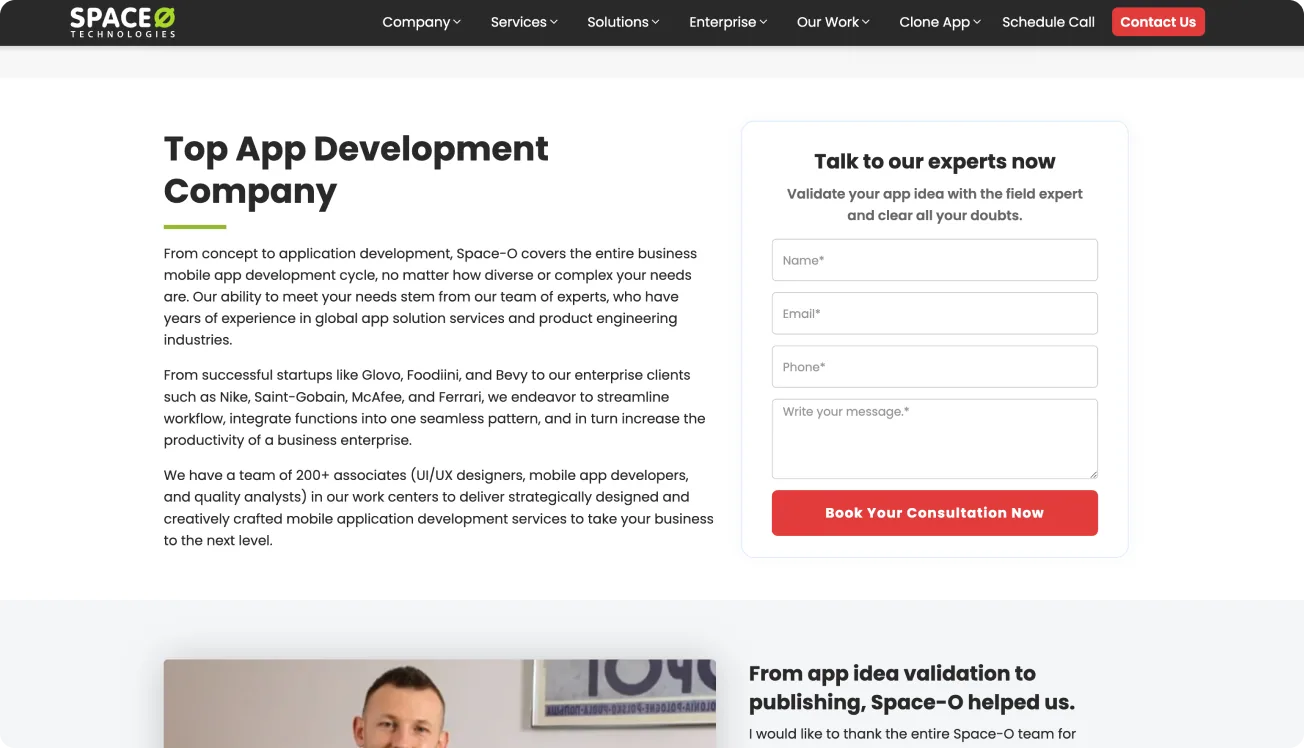
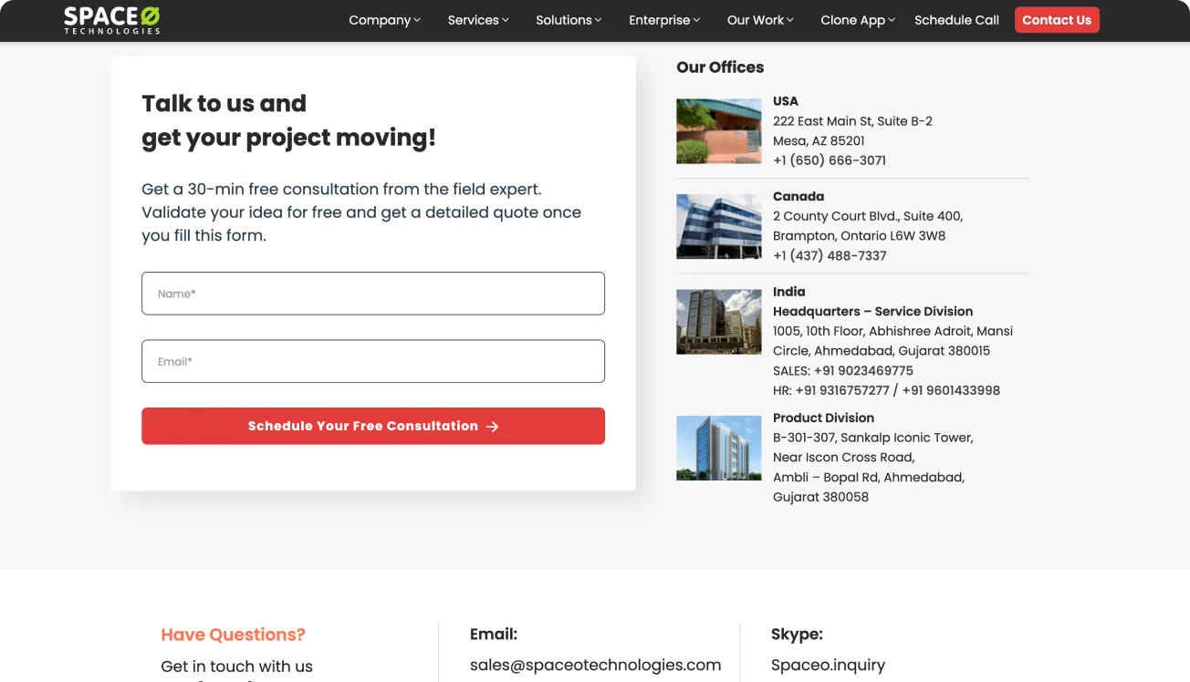
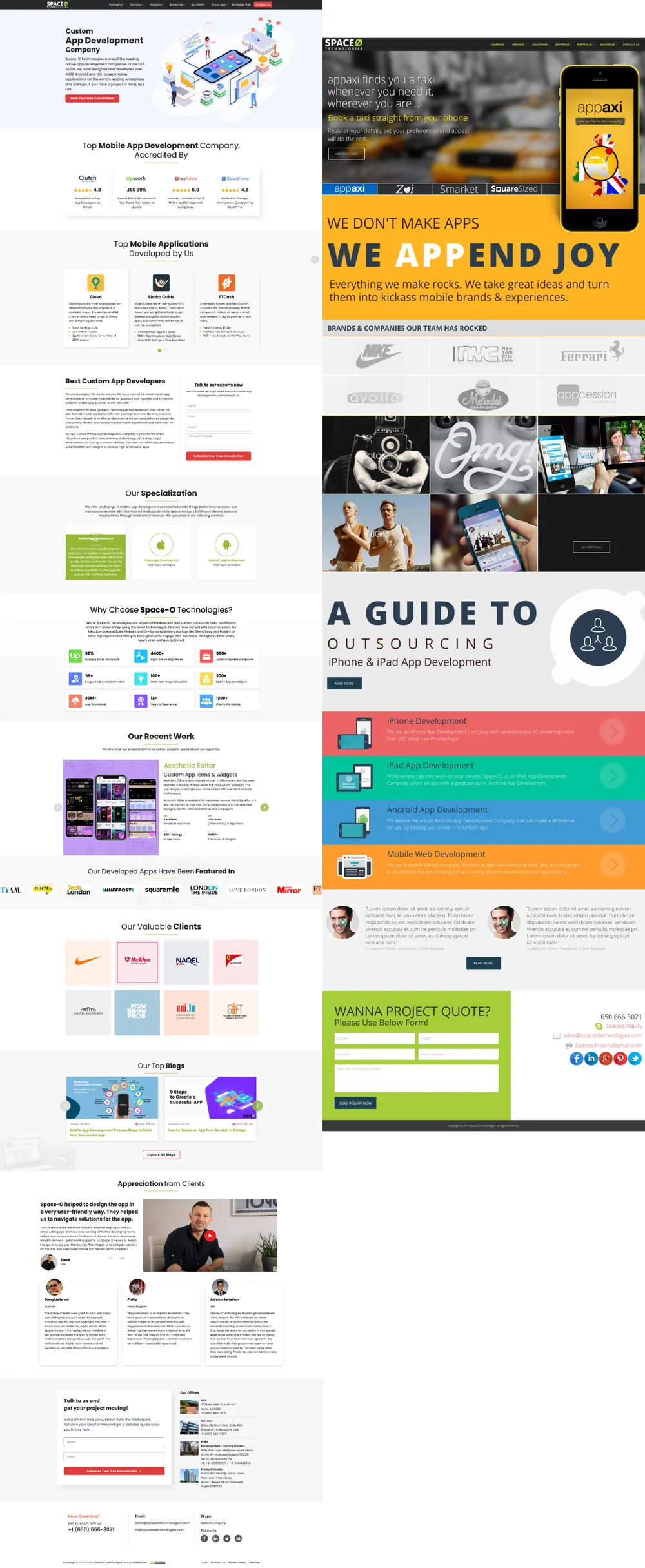
Each section of the home page has one job, from the first impression down to the inquiry form.
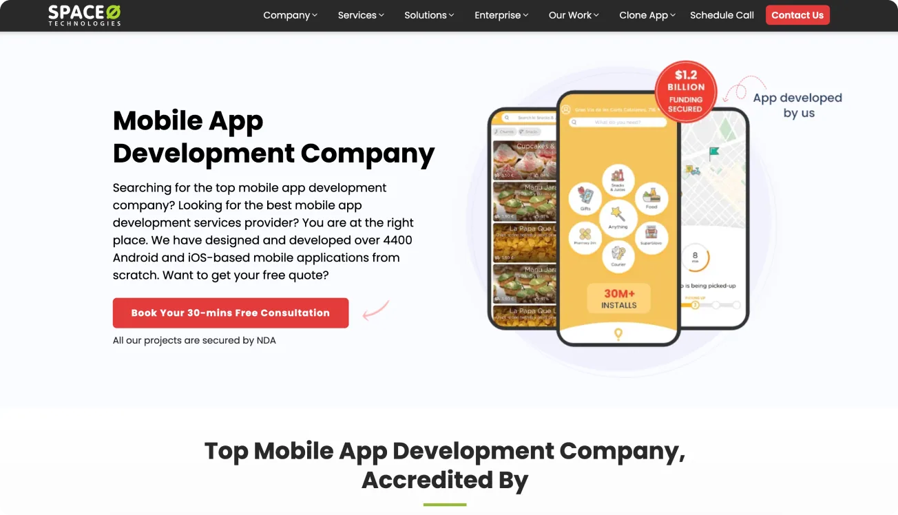
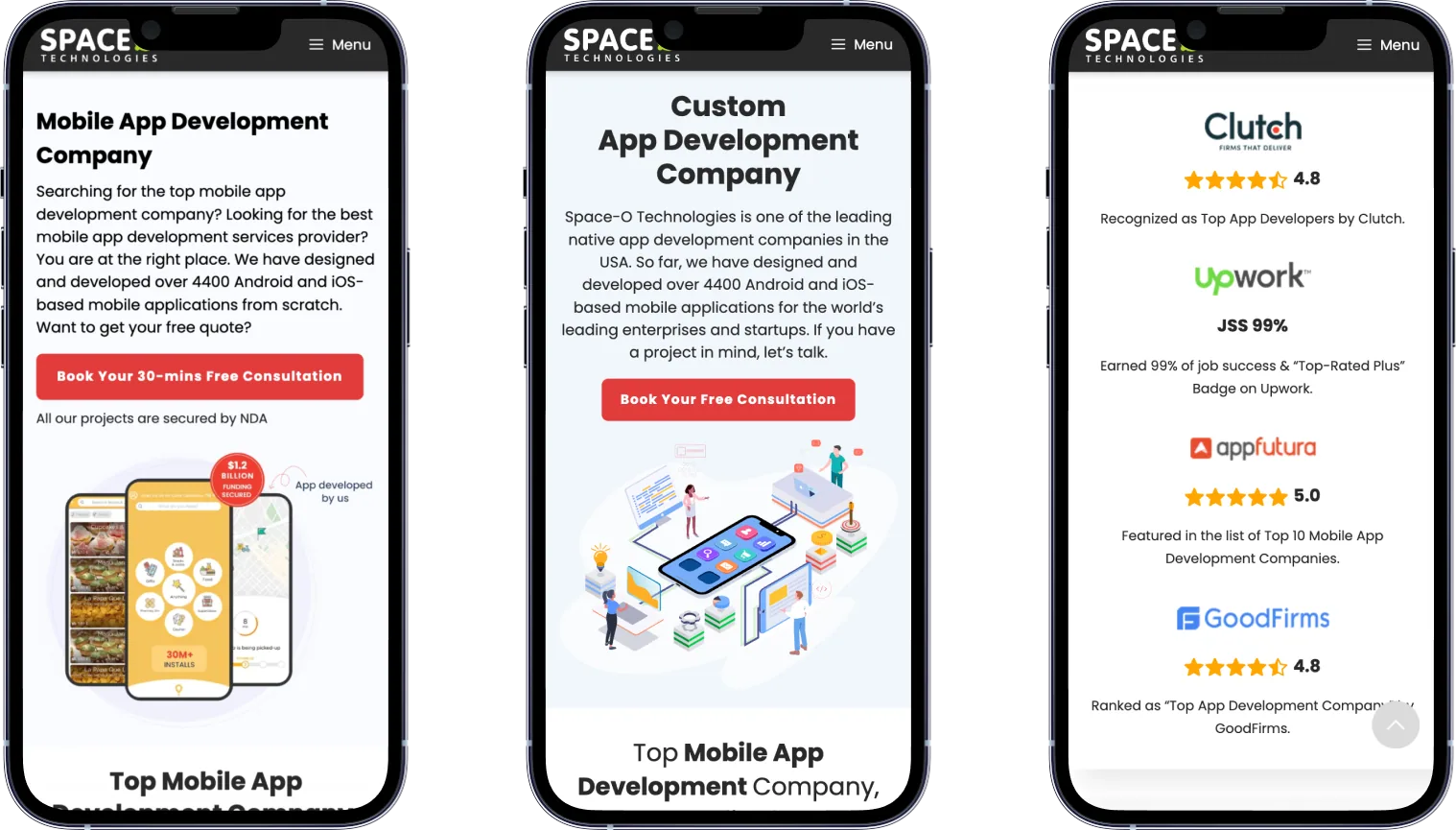
Responsive by default
Process
- Content-first UX strategy with reorganized navigation and a mega menu
- Sitemap and style guide
- Grid and card based UI on a reusable design system
- Remote usability test with five participants, then sharper CTAs and less clutter on service pages
Final design
The full home page. Hover to scroll through it, or click to open it full size.
Outcome
Clear service categories, consultation and portfolio CTAs, consistent type hierarchy, social proof from testimonials, awards and client logos, all responsive on a Bootstrap build.