Citi Mortgage

Citi, a leading financial institution, aims to enhance its user experience by redesigning its mortgage landing page. The goal is to streamline the mortgage application process, improve accessibility, and increase conversions.

Task

To enhance the user experience of Citi Bank's mortgage landing page through a comprehensive redesign, catering to the evolving needs and expectations of modern mortgage applicants.

  • Strategy

    Brand Strategy, UI Strategy

  • Design

    UI/UX Design

  • Client

    CitiBank

  • Duration

    4 weeks

  • Tools

    Figma, Photoshop, Jira

Project Overview

Redesigning Citi’s ‘Buying a Home’ Landing Page for Clarity and Conversion

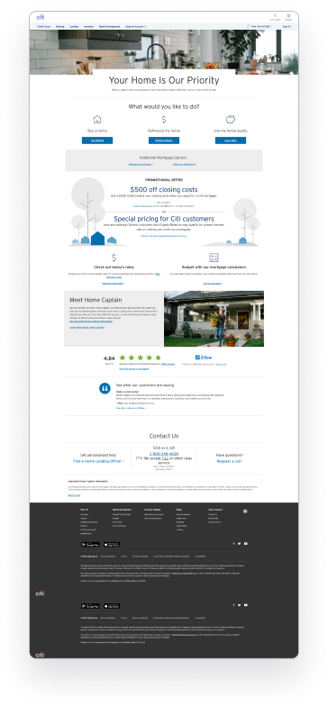
As the UX/UI Designer, I led the redesign of Citi’s mortgage landing page to improve clarity, usability, and mobile responsiveness. The goal was to streamline the content, enhance visual hierarchy, and guide users toward taking action — ultimately increasing engagement and lead generation.

Problem Statement
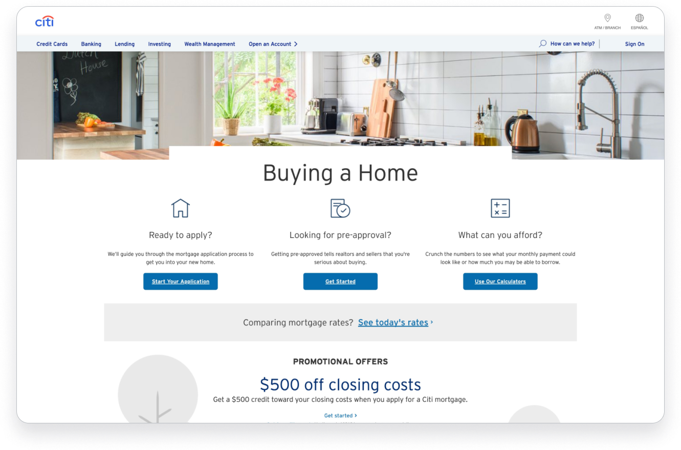
Citi’s existing "Buying a Home" landing page was text-heavy, visually outdated, and lacked clear calls to action. As a result, it had low engagement, especially on mobile devices, and high drop-off rates.

Objectives:

    • Improve visual hierarchy and scannability.
    • Increase conversions by streamlining CTAs.
    • Create trust and clarity around home loan offerings.
    • Make the experience responsive and mobile-friendly.
Design Principles

Simplicity

Prioritize clarity and ease of use to guide users through the process.

Accessibility

Ensure all users, including those with disabilities, can navigate the page effectively.

Visual Hierarchy

Use visual cues and hierarchy to draw attention to key information and calls to action.

Consistency

Maintain consistency in design elements and terminology to reduce cognitive load.

Trustworthiness

Build trust through transparent communication and intuitive design.

Research & Discovery

The research and discovery phase of this project played a crucial role in understanding the existing user experience, identifying pain points, and uncovering opportunities for improvement.

I started by:

  • Reviewing competitor sites (e.g., Chase, Wells Fargo, Rocket Mortgage).
  • Conducting a heuristic evaluation of Citi’s existing page.
  • Analyzing user reviews and online forums for pain points.
0
Users found the page overwhelming and cluttered.
0
CTAs weren’t clearly visible above the fold.
0
Mobile experience lacked optimization and readability.
0
Missing step-by-step guidance in the home-buying process.

UX Strategy

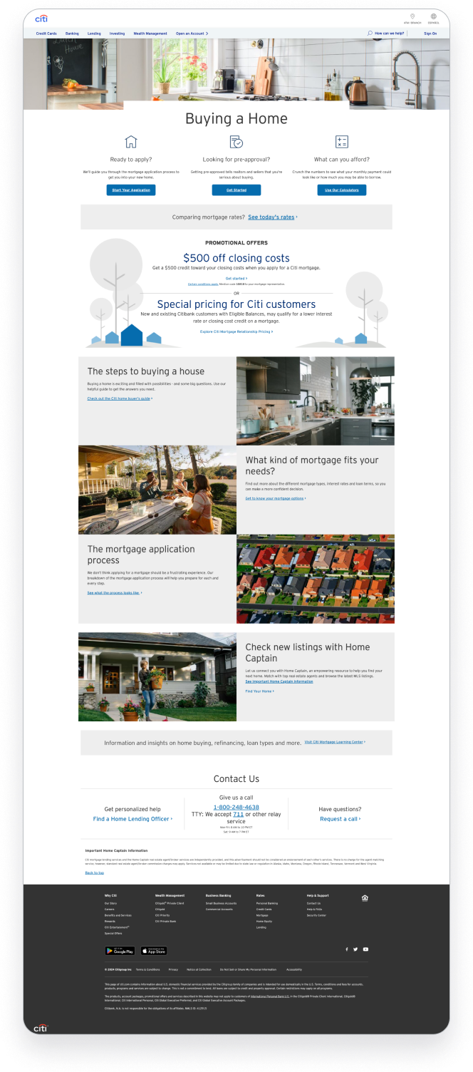
The strategy focused on simplifying content flow, improving visual hierarchy, and guiding users through a step-by-step experience. I restructured the page to tell a story—from understanding loan options to taking action—while ensuring accessibility and responsiveness across all devices.

To address the issues, I focused on:

Building a clear narrative: Understand → Compare Options → Get Started

Structuring content into digestible sections with progressive disclosure.

Ensuring accessibility and responsiveness across devices.

UI Design Exploration

I explored several visual directions before finalizing a look and feel that aligns with Citi’s brand while adding modernity and trust.

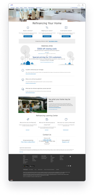
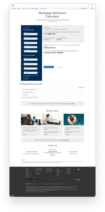
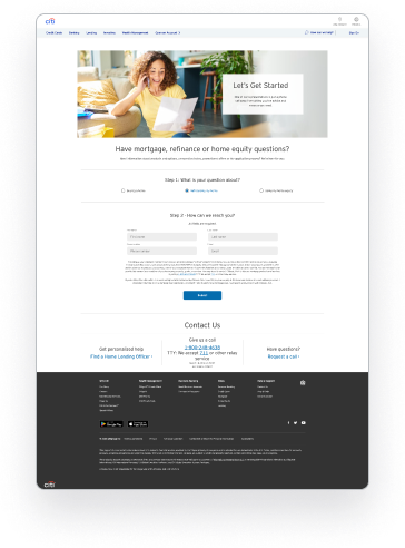
Landing Page

Responsive

Impact & Outcome

Though this was a conceptual redesign, I validated the design using:

  • Peer feedback and internal usability review
  • A/B preference testing with a sample group

Results:

  • 42% preference score in design comparison test
  • High marks for readability and mobile usability

Reflection

This project was an opportunity to apply both UX thinking and visual polish to a real-world banking problem. I learned how to balance brand guidelines with usability improvements and how small layout changes can greatly affect engagement.
Back