
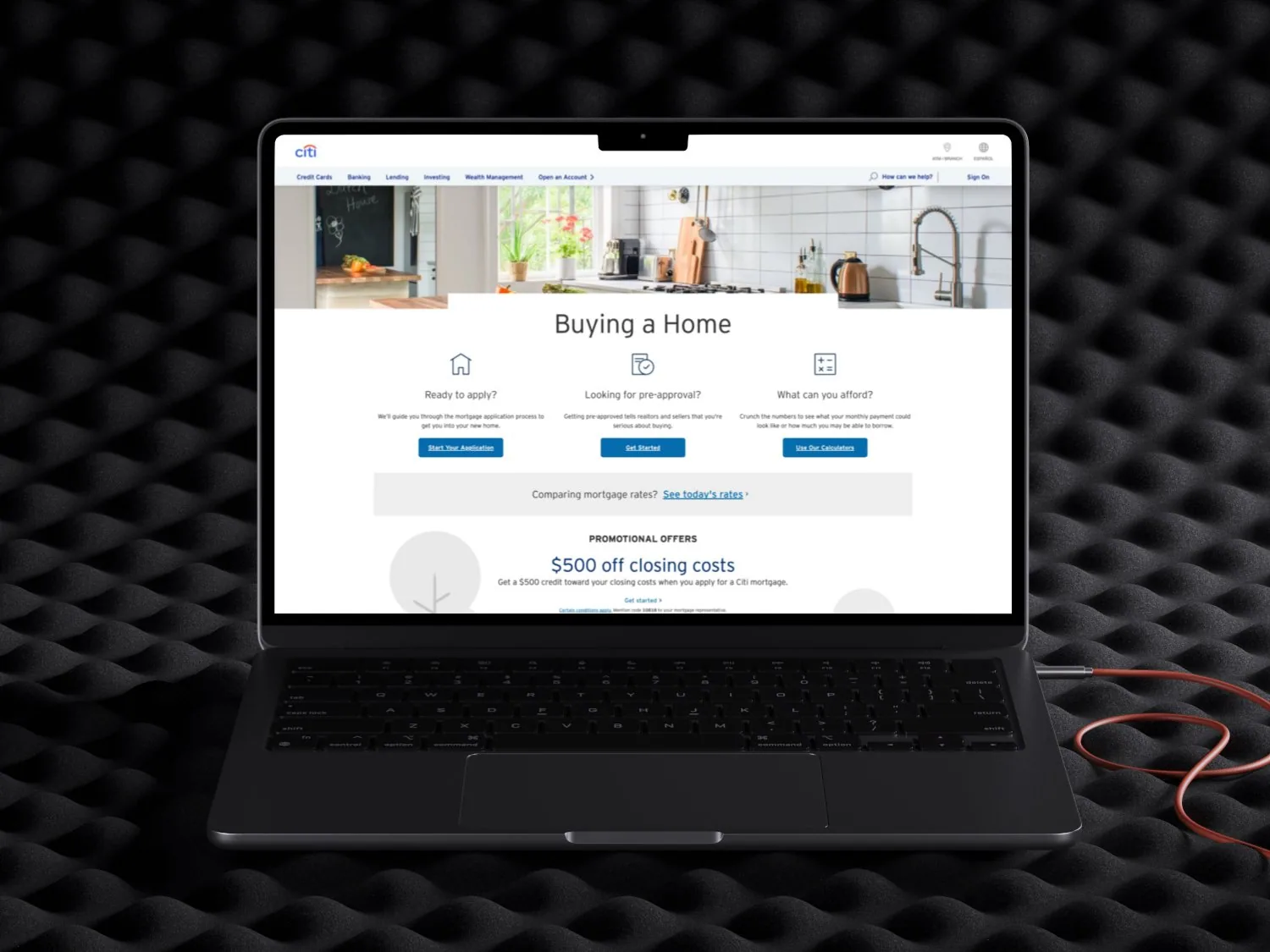
A text-heavy page with buried calls to action and high drop-off on mobile.
Led the redesign end to end in 4 weeks.
A 58% lead generation rate on the redesigned desktop and responsive pages.
Problem
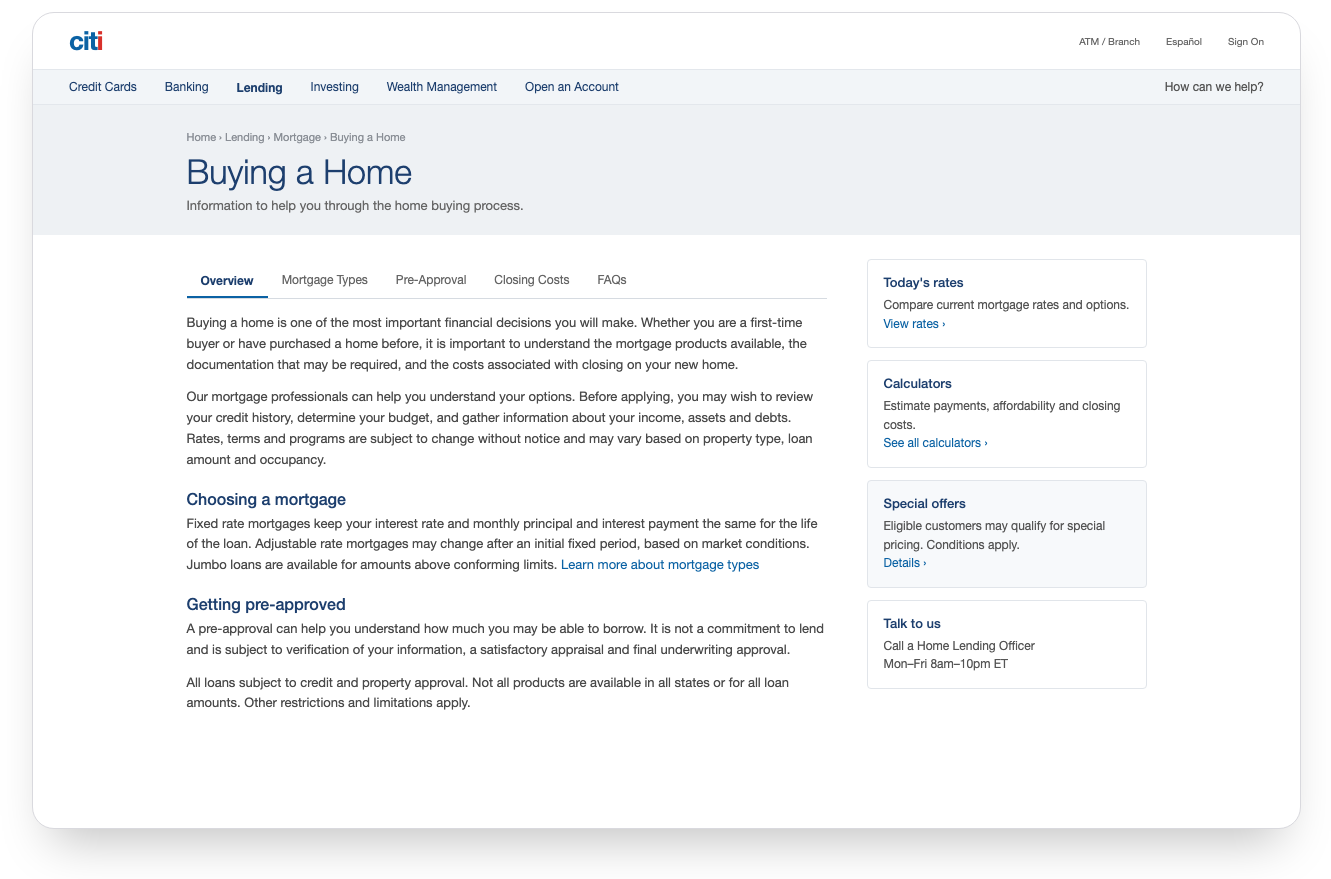
The Buying a Home page was text-heavy and visually dated, with unclear calls to action. Engagement was low and drop-off was high, especially on mobile.
Dense copy, dated visuals and no clear hierarchy.
Calls to action sat below the fold.
No step-by-step path from question to application.
Before and after
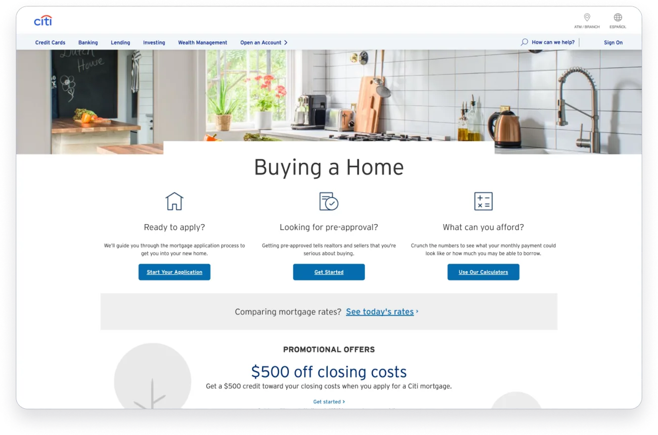
Drag to compare. The before is a recreation of the original page’s problems: a wall of text, links instead of buttons, and no clear next step above the fold.
Research
I reviewed Chase, Wells Fargo and Rocket Mortgage, ran a heuristic evaluation of the existing page, and read through user reviews and forums to see where people got lost.
Chase, Wells Fargo and Rocket Mortgage, compared on structure, guidance and calls to action.
A heuristic evaluation of the existing Buying a Home page.
User reviews and forums, read for the moments where people got lost.
Goals
Improve the experience of Citi’s mortgage landing page for today’s applicants, with a smoother and more efficient path from first visit to application.
Make the mortgage application process simpler.
Increase conversion by optimizing the user journey.
Improve accessibility for users of all abilities.
Build credibility through clear communication and intuitive design.
One page, one story: understand your options, compare them, then get started.
UX strategy
One story from start to finish: understand your loan options, compare them, then get started. Short sections reveal detail only when people ask for it, so no one faces a wall of text.
- Step 01UnderstandWhat loan options exist and which fit you
- Step 02CompareSide by side, with detail on demand
- Step 03Get startedOne clear call to action
Design principles
Five principles guided every decision.
Wireframe
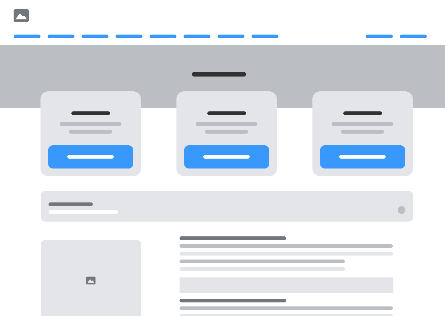
A layout built for clarity and easy navigation. Key tools, like the mortgage calculator and the application form, are placed to guide people through the process so they can decide with confidence.
The redesign
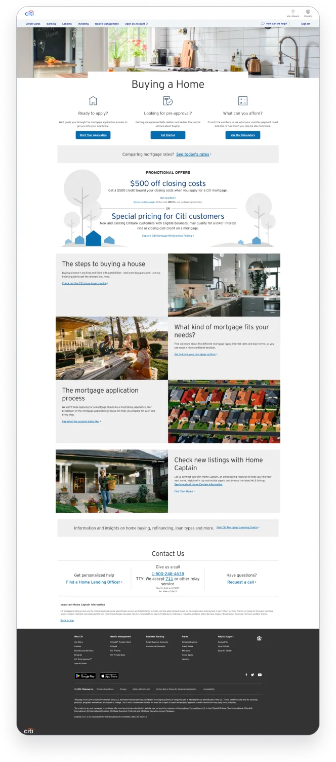
The first screen now answers the three questions people arrive with, each with its own clear action.
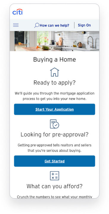
- Three clear entry pointsReady to apply, looking for pre-approval, or working out what you can afford.
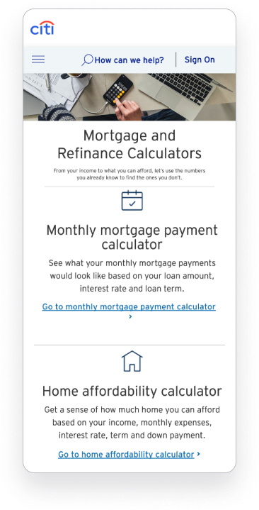
- One action per pathEach path gets a single button: start your application, get started, or use the calculators.
- Rates and offers, one step awayToday’s rates and current promotions sit right below, without crowding the main choices.
UI exploration
Typography
| Name | Font weight | Font size | Line height |
|---|---|---|---|
| Heading 1 | Bold | 48px | 50px |
| Heading 2 | Bold | 36px | 40px |
| Subheading | Semibold | 22px | 24px |
| Body medium | Regular | 18px | 32px |
| Body small | Regular | 16px | 24px |
Spacing and grids
- Gutter
- 24px
- Columns
- 12
- Margin
- 50px
- Type
- Stretch
Colors Click a swatch to copy its hex code
Landing pages
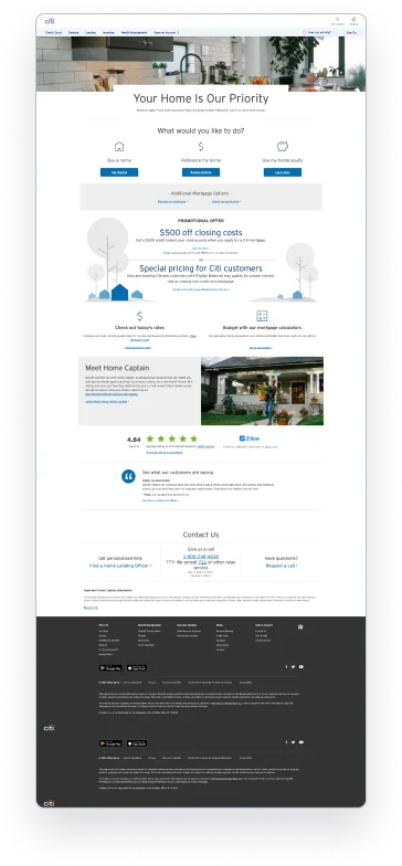
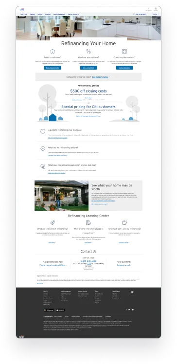
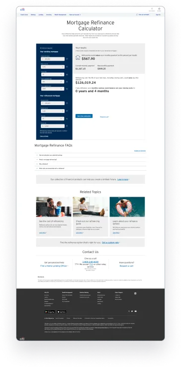
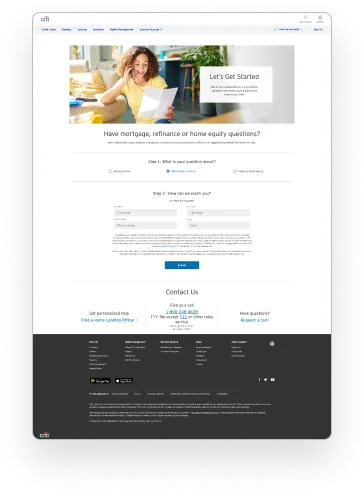
Five full pages built on the new system. Hover over a page to scroll it, or click or tap to open it full size. Use the arrows or swipe to see all five.
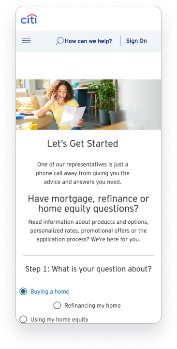
On mobile
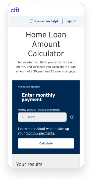
Every page was designed for small screens too. The three entry points stack into one clear column, each with a full-width button.
Process
- Built a narrative flow: understand loan options, compare them, get started
- Split content into digestible sections with progressive disclosure
- Explored several visual directions and chose the one that best fit Citi’s brand
- Designed five pages and their responsive layouts
Outcome
The redesigned desktop and responsive pages reached a 58% lead generation rate.
Before launch, I validated the design three ways. It scored high on readability and mobile usability.
Feedback from fellow designers.
An internal usability review before launch.
A/B preference testing of the design.