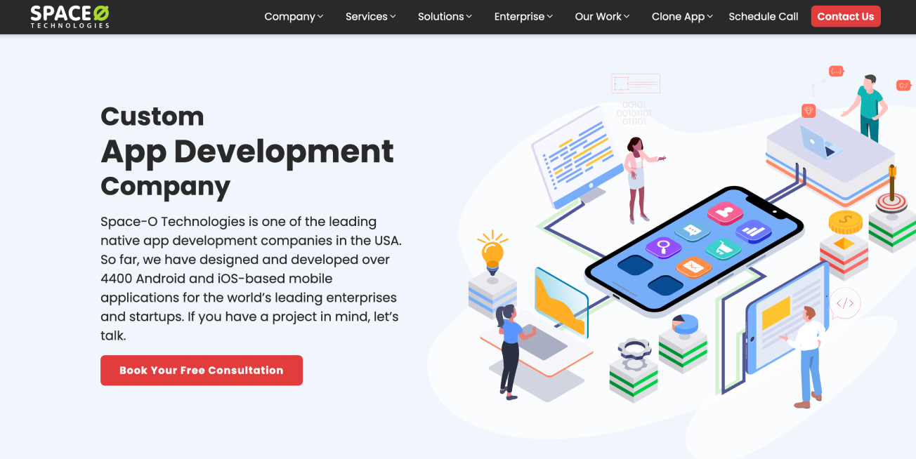
Space-O Technologies
Task
Space-O Technologies, a leading player in web and mobile app development, aimed for a website redesign to strengthen its online presence and better showcase its expertise and services. As the lead UX/UI designer on the project, my role involved revamping the website to align with modern design trends, enhancing user experience, and ultimately driving engagement and conversions.
Space-O Technologies is a leading mobile app development agency serving global clients. Their existing website lacked modern design appeal, intuitive navigation, and a clear user conversion path. I was brought in to redesign their website to reflect their brand’s maturity, improve lead generation, and elevate the overall user experience.

Tech startups and enterprise companies looking for a mobile development partner
Non-technical founders looking for end-to-end mobile solutions
Product managers or CTOs evaluating vendor capabilities
I began with a heuristic evaluation and stakeholder interview to understand pain points and business goals.


Adopted a flexible, grid-based structure using cards to organize content clearly and consistently across pages.


")
")
")
")
")
Design that stands out on mobile, Code that is easy to use and quick to load in the mobile browser.
")

I conducted a remote usability test with 5 participants representing real user personas.
-
Made CTAs more prominent
-
Reduced visual clutter on service subpages
This project reinforced the importance of pairing strong UX thinking with clear business KPIs. Designing for scale, clarity, and credibility can significantly improve conversion for service-based companies.