
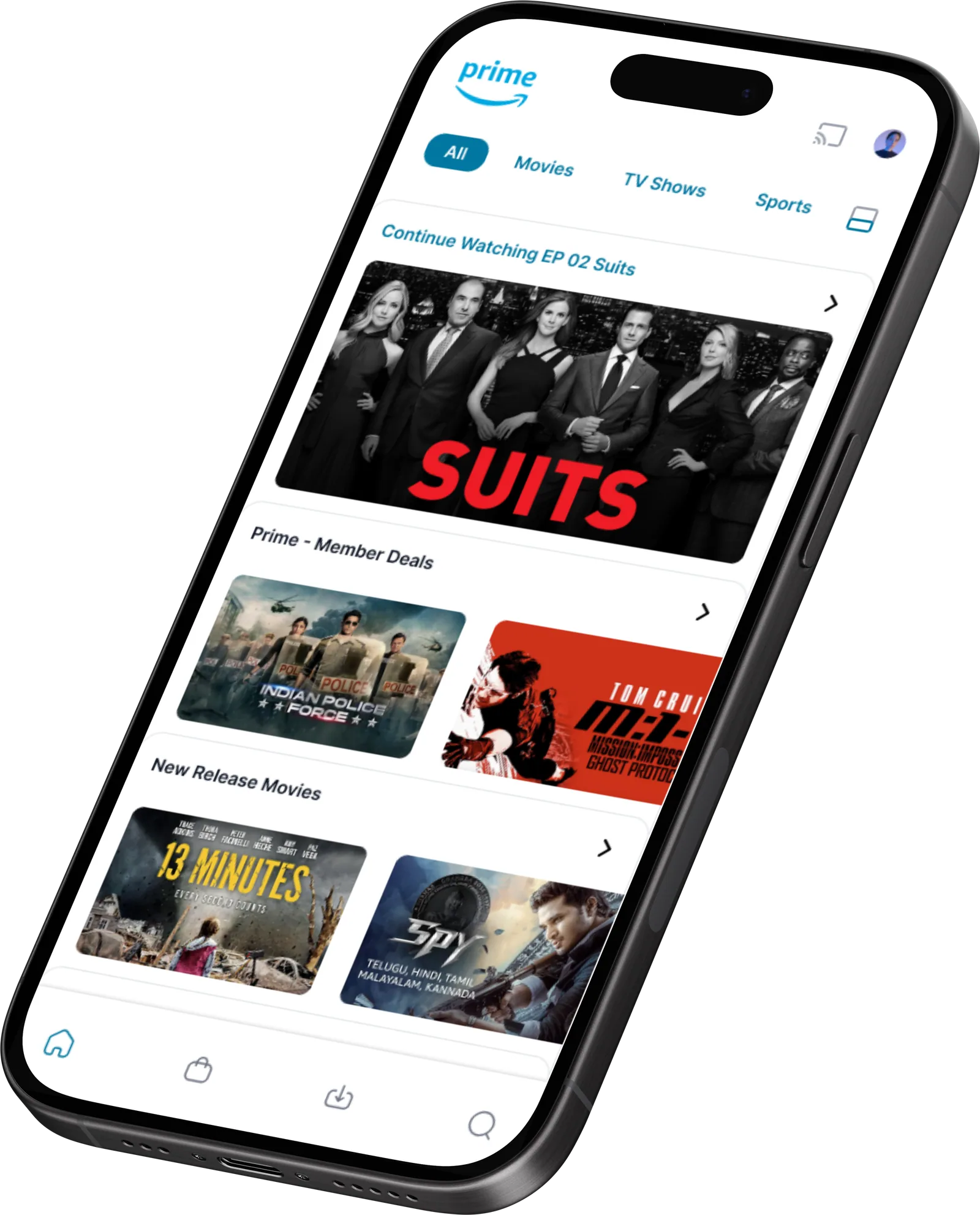
Finding something to watch took too long.
UI design and brand strategy in a 5-day sprint.
Four screens rebuilt around a personal feed.
Goal
Make the app more engaging, intuitive and visually appealing, so people interact more and discover more content.
Scope
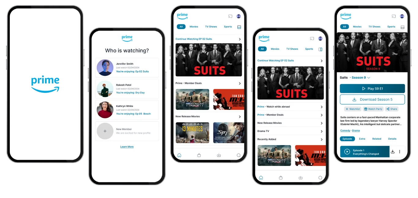
The screens
Splash
A minimal Prime mark over a background that shifts with your viewing history.
Profile
Clearer access to settings, history and recommendations, with avatars for quick switching and what each person was last watching.
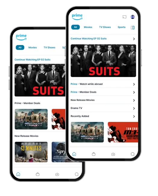
Home
Reorganized around a personal recommendation feed: continue watching first, then deals, new releases and genres.
Detail
Trailer, cast, similar titles and reviews visible without scrolling, with swipeable similar titles.
All together
The full flow
Splash to profile to home to detail, in one pass. Aimed at more exploration and less decision fatigue.
Outcome
Aimed at more exploration and less decision fatigue. The study reports qualitative results only.