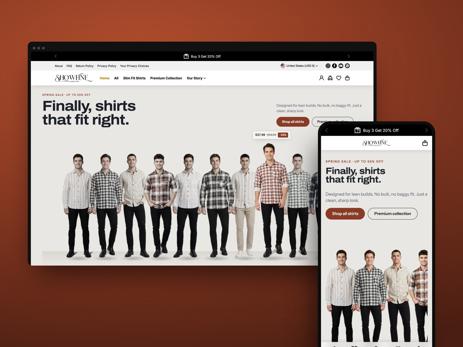
Slim men don't trust online shirt shopping: sizes run big and fit is a guess.
Owned the UX end to end, from research to launch, plus checkout, lead generation and marketing materials.
A live store in one month, with 500+ happy customers who found their fit.
Overview
The Showfine is a men’s shirt label with one promise: shirts that fit lean builds. As Sr. Product Designer, I owned the user experience end to end, from research to a live Shopify store, including checkout, lead generation and the marketing materials. The whole project took one month.
Problem
Slim men don’t trust online shirt shopping. Standard U.S. sizes run big, product photos rarely show how a shirt sits on a lean body, and a wrong size means a return. For a new brand, every return eats margin and every doubt kills the sale.
“Will this look baggy on me?” Flat lays and generic models don’t answer it.
S, M, L mean different things at every brand, and size charts are hard to read.
An unknown label has to prove shipping, returns and checkout are safe.
Who we designed for
A proto-persona built from the research, used to judge every design decision.
Most shirts fit my shoulders but hang like a tent everywhere else.
Goals
- Shirts that look sharp without tailoring
- Know the size will fit before ordering
- A few versatile shirts in one order
Frustrations
- Boxy fits and long sleeves
- Size charts that don’t match reality
- Return hassles with unknown brands
Research
I started by talking to 10 people to understand how slim men shop for shirts online and where the experience breaks. Three insights shaped the design:
People judge fit from how a shirt looks on a body like theirs, not from the fabric or a flat lay.
Size is the biggest point of hesitation, and a chart alone doesn’t remove it.
Shoppers who find a fit they trust want several shirts, if the deal is clear.
Design goal: make shoppers sure about fit before they ever reach checkout.
Shopper journey
Mapping the path from first visit to checkout showed where doubt creeps in, and where each design decision had to land.
Design decisions
Each key screen answers one moment of doubt from the journey.
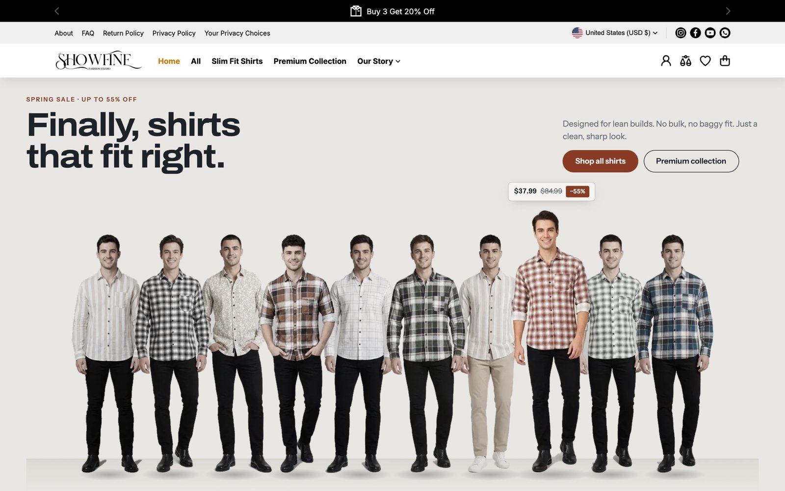
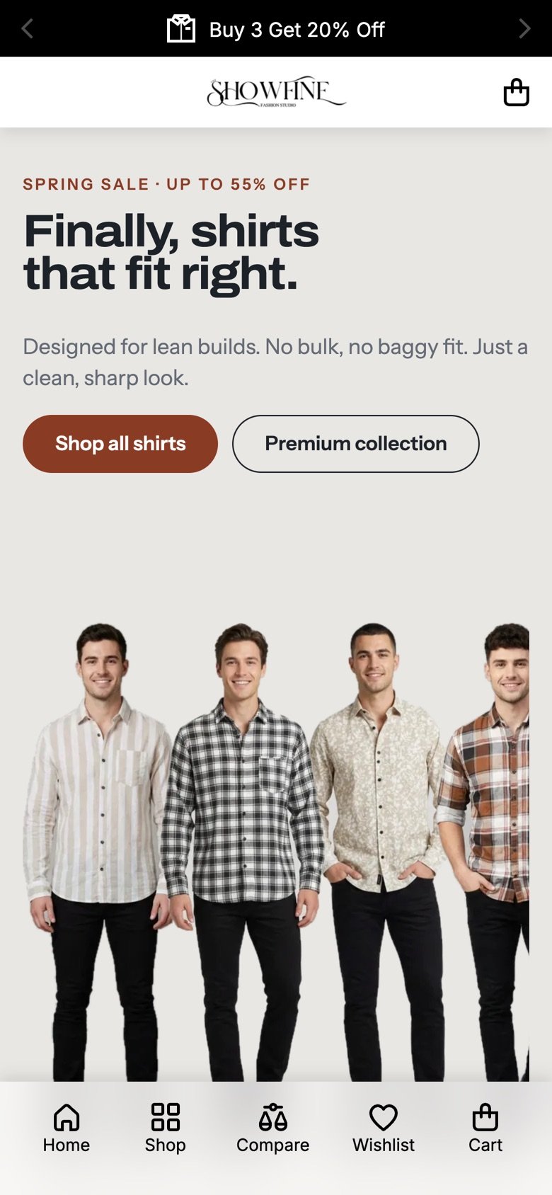
Show the fit, not a banner
- Insight
- Shoppers judge fit from a body like theirs.
- Decision
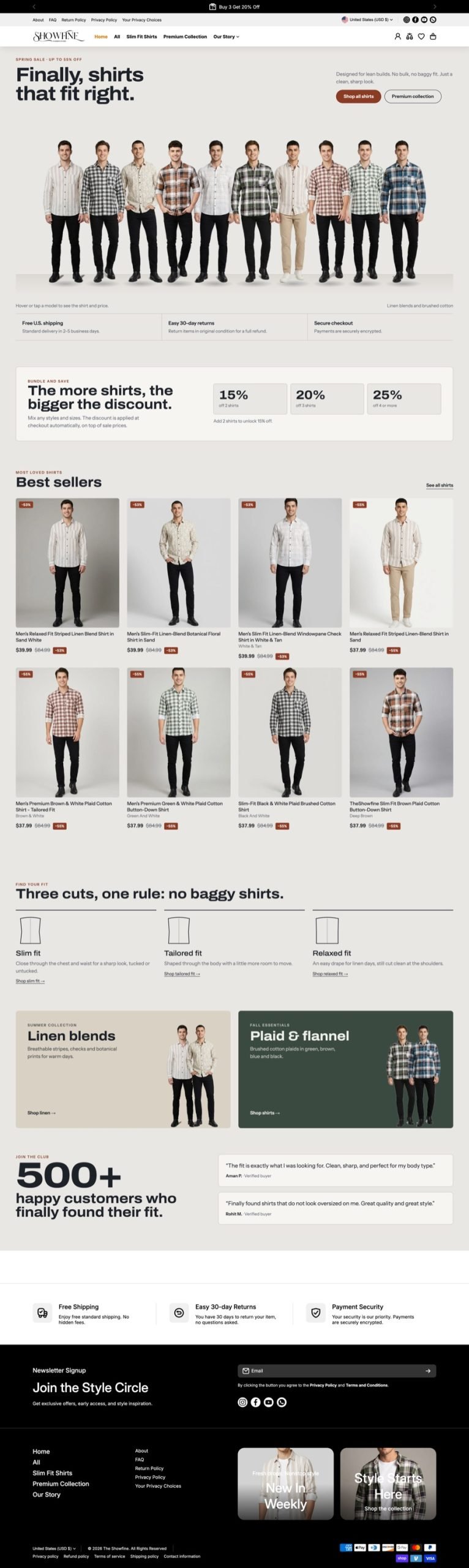
- Replace the hero banner with a line-up of ten models. Hover or tap one and he steps forward with the price.
- Why it works
- The first screen proves the promise and doubles as the catalog, so people start browsing straight away.
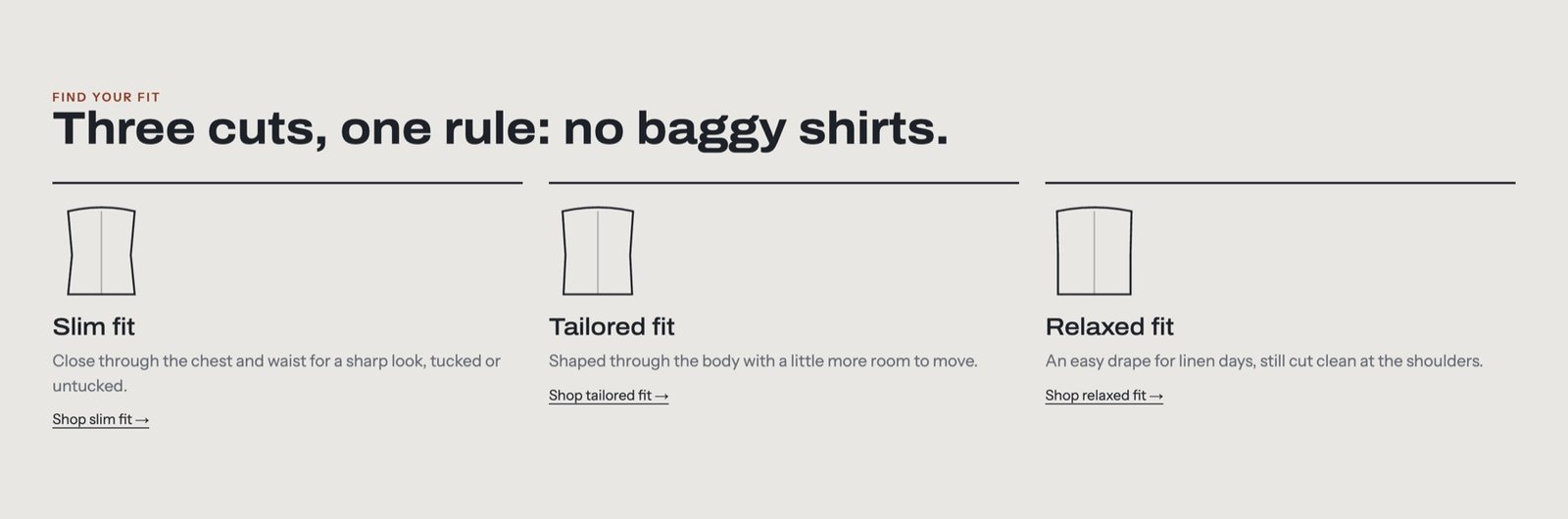
Name the cut before the pattern
- Insight
- Without a sense of cut, every shirt is a gamble.
- Decision
- Three fits, each with a simple outline and one line on how it wears.
- Why it works
- People choose a shape that suits their build first, so they’re less likely to pick a pattern they’ll return.
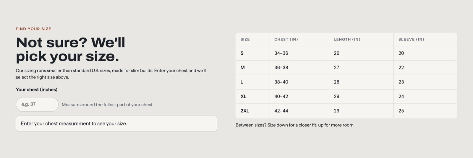
Answer the size question for them
- Insight
- Size is the biggest point of hesitation.
- Decision
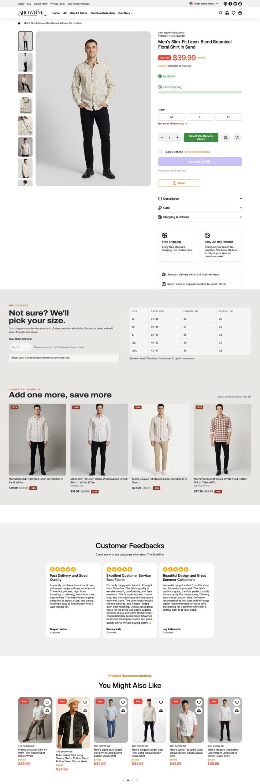
- A size finder on every product page: enter your chest and the right size is selected, with the chart beside it.
- Why it works
- It turns a chart to decode into one confident answer, right where people decide.
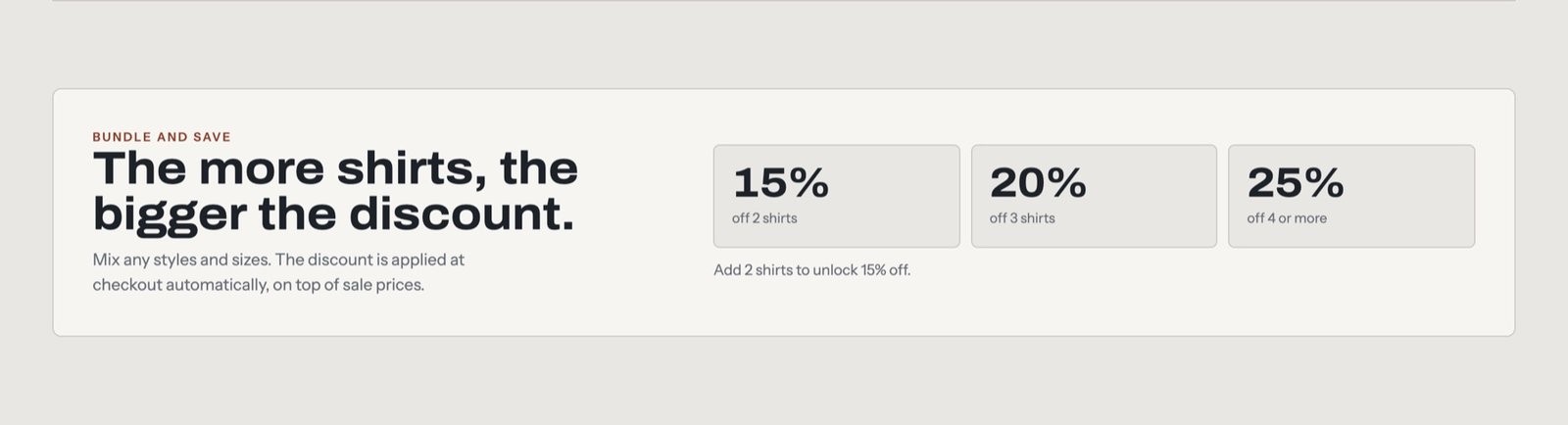
Make buying more the obvious deal
- Insight
- Once fit is trusted, people want several shirts.
- Decision
- Simple 15/20/25% tiers, applied automatically, with a hint showing how many shirts unlock the next tier.
- Why it works
- Clear rules and no codes to remember make a bigger basket feel like a win, not an upsell.
Ideate and test
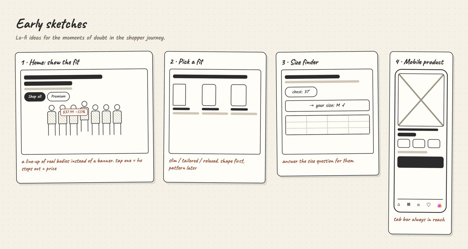
From sketches to a prototype, then into real users’ hands before building.
Sketched directions for the hero, fit guidance and bundles, then built the strongest into a clickable prototype.
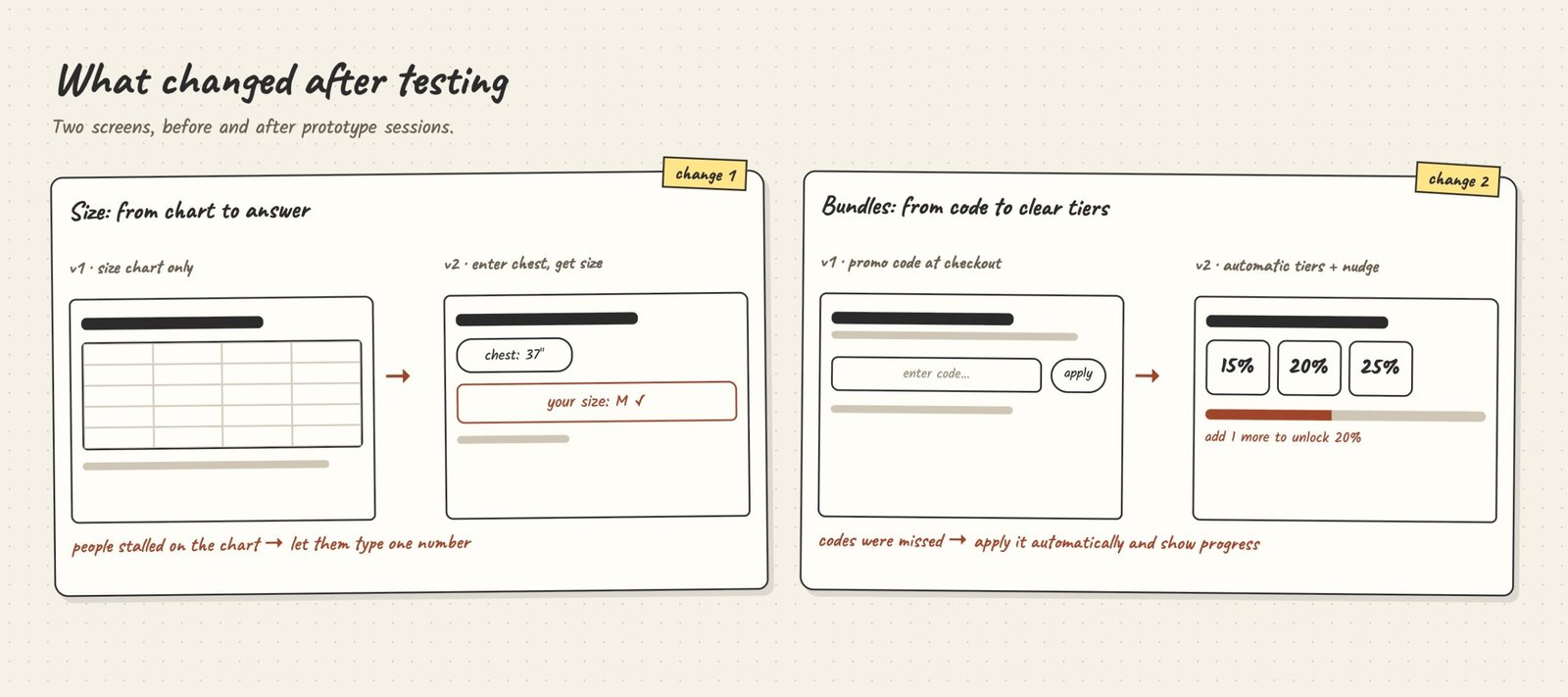
Tested the prototype with users. Two things changed: people stalled on the size chart, so the size finder now gives one answer from a chest measurement; and promo codes were easy to miss, so bundle discounts now apply automatically with a progress nudge.
Final design
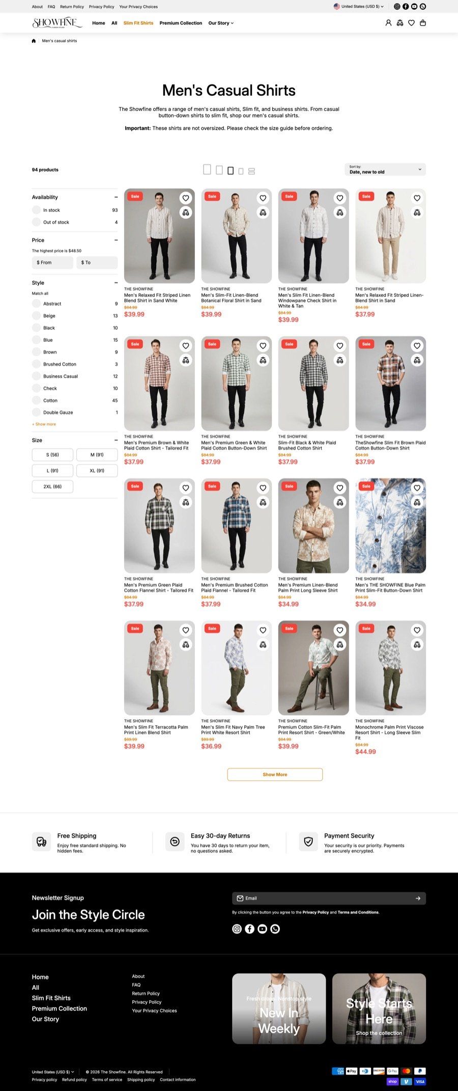
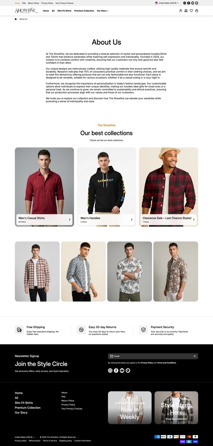
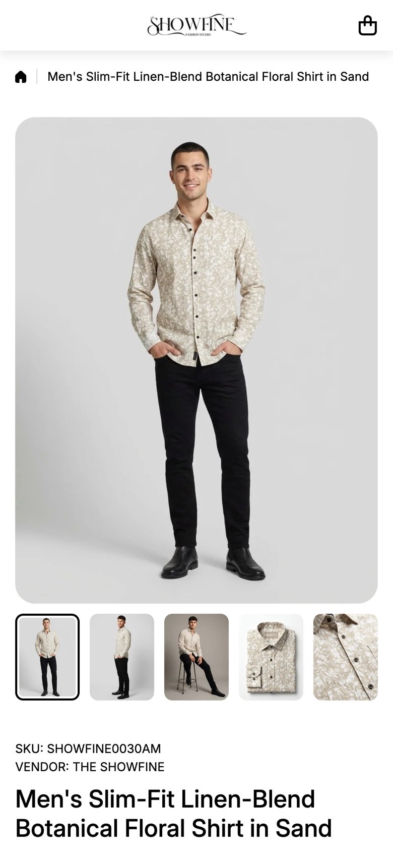
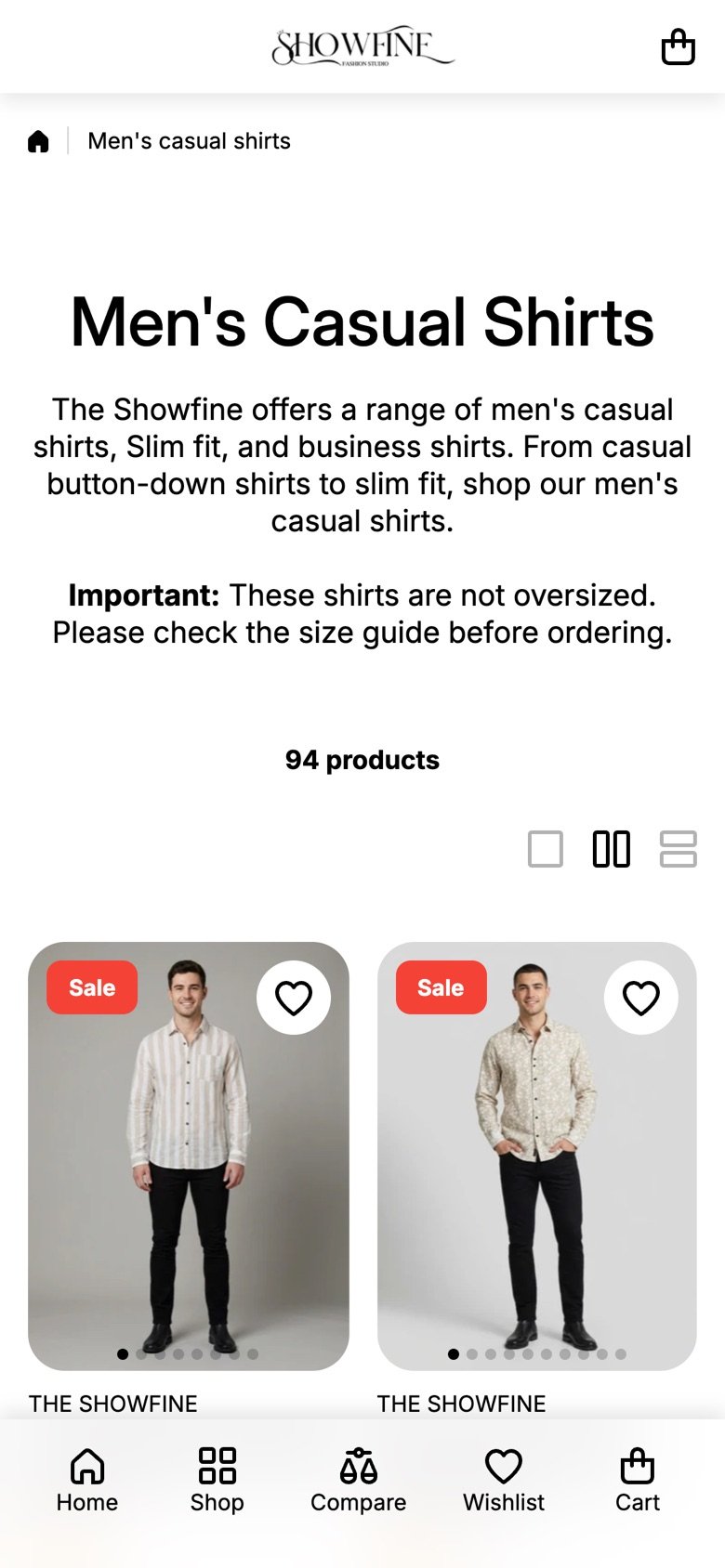
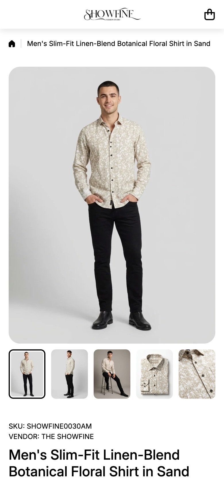
The live store across key pages. Hover over a page to scroll it, or click or tap to open it full size.
Designed for the phone
Most shoppers arrive on mobile, so a bottom tab bar keeps Home, Shop, Compare, Wishlist and Cart one thumb away.
Process
- Research. Talked to 10 people about how slim men shop for shirts online, and where fit and size let them down.
- Ideate. Sketches, then a prototype of the strongest ideas.
- Test. Prototype sessions with users, then two key changes: a size answer instead of a chart, and automatic bundle tiers.
- Launch. Shopify build, lead capture and marketing materials.
Outcome
The store went from first research to launch in one month.
A 10% sign-up offer and the “Style Circle” newsletter capture leads from day one.
What I’d do next
Track size-related returns to see if the size finder is working.
Let buyers share height, build and size bought, so fit proof grows with every order.
Add height and build to the size finder for even more confident picks.