January 9, 2024

Lenstar Photo Editing Mobile App

In the rapidly evolving world of digital photography, the demand for intuitive, powerful photo editing tools has never been higher. Recognizing this need, we embarked on the journey to create Lenstar, a cutting-edge photo editing application designed to cater to both amateur and professional photographers. This case study outlines the design process, UI/UX elements, and the collaborative efforts that brought Lenstart to life.

Task

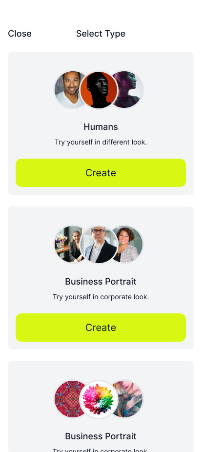
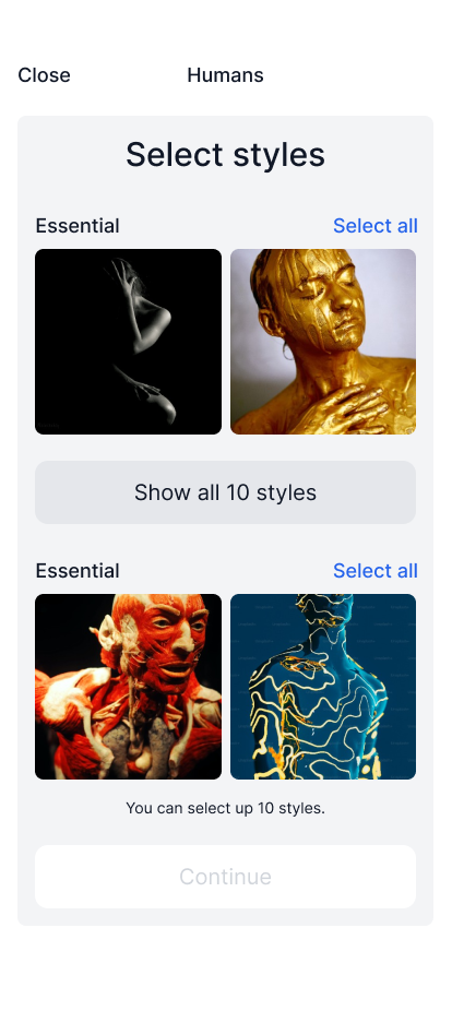
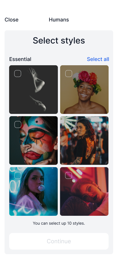
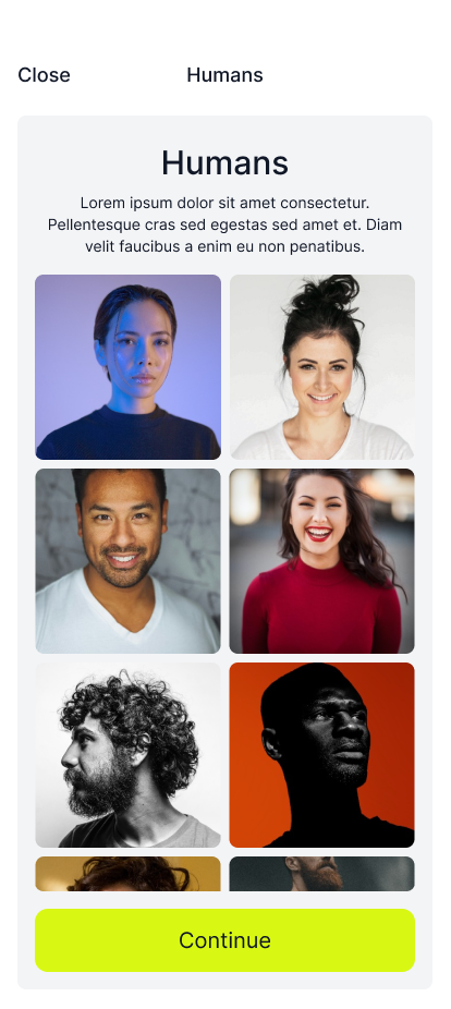
Create an intuitive and user-friendly photo editing interface that feature AI editing, live photo scanning, and magic package for users

  • Strategy

    Brand Strategy

  • Design

    UI UX Designer

  • Client

    Freelance

  • Tools

    Figma, Photosho

Lenstar

Your Best AI Photographer

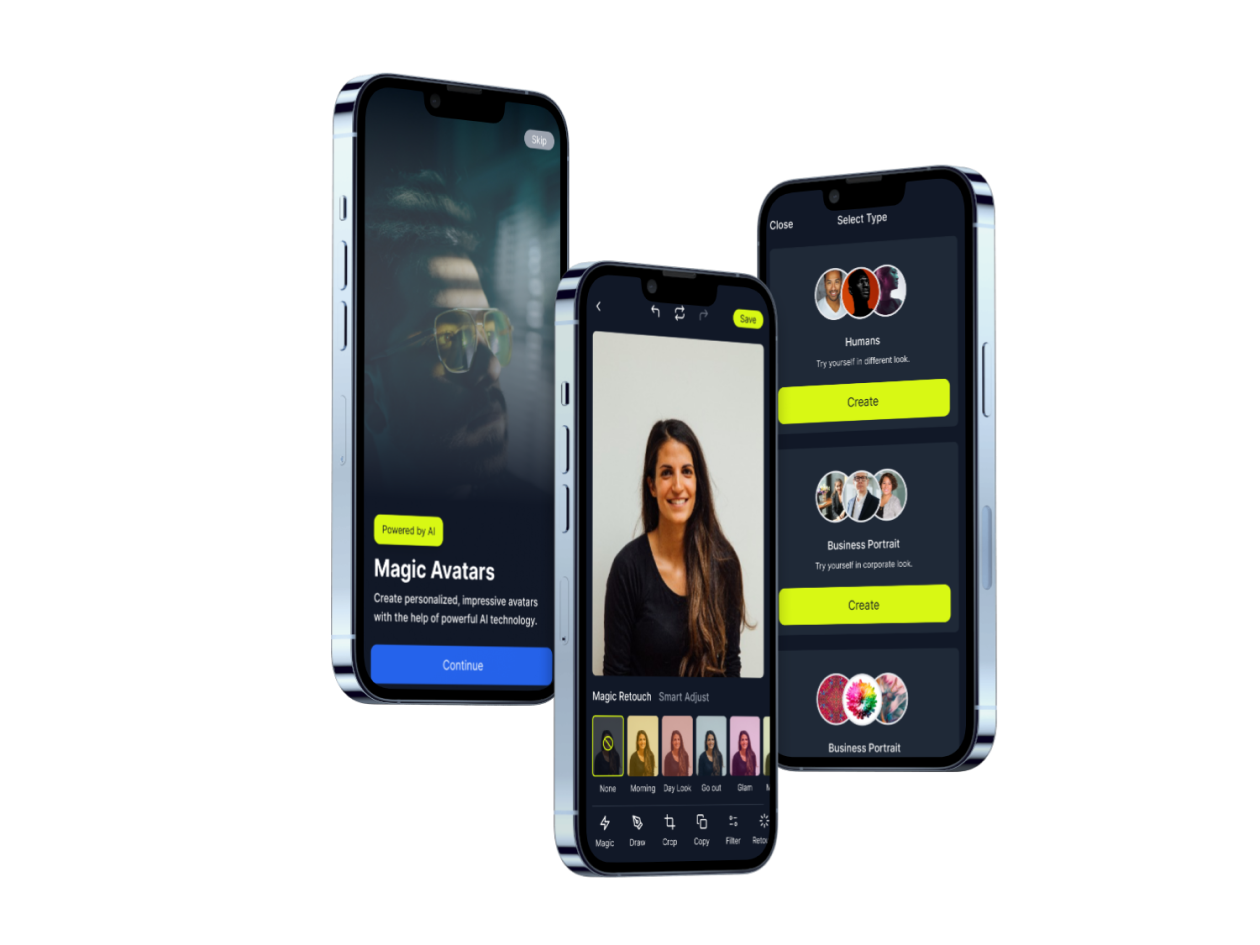
Lenstar is an all-in-one image editing app that takes your photos to the next level.

Understanding the Requirement: Collaboration with the Research Team

Lenstar’s inception was the result of a significant collaborative effort with our research team. We conducted surveys, interviews, and market analysis to identify key user needs and pain points in existing photo editing software. Based on user feedback, we learned that users wanted a more intuitive interface, versatile editing tools, and customization options to enhance their photo editing experience. With this valuable insight, we set out to design an app that was both powerful and accessible to meet our users’ needs.

Design Process: Figma and Photoshop
Our design process was iterative and user-centered, utilizing Figma and Photoshop to create UI elements, wireframes, and prototypes. Figma facilitated real-time collaboration, allowing our team to work together seamlessly, while Photoshop was instrumental in refining visual details and creating high-fidelity mockups.
Step 1.

Wireframing

We began with low-fidelity wireframes to layout the basic structure of the app, focusing on usability and flow. This stage was crucial for establishing the foundation of the user interface without getting bogged down by aesthetic details.

Step 2.

UI Design

With the wireframes in place, we transitioned to the UI design phase. Here, we developed the visual language of Lenstart, including color schemes, typography, and iconography. The goal was to create a visually appealing interface that also enhanced usability.

Step 3.

Prototyping

Using Figma, we created interactive prototypes to simulate the user experience. This allowed us to test and refine navigation, transitions, and interactions, ensuring that the app was not only beautiful but also intuitive to use.

Step 4.

Themes

Recognizing the diverse preferences of our user base, we designed Lenstart with both dark and light themes. This feature was developed to ensure optimal viewing comfort in various lighting conditions, enhancing the overall user experience.

UI/UX Highlights

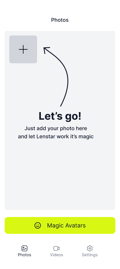
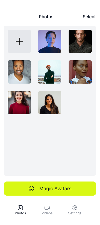
  • Intuitive Navigation: We designed the navigation to be intuitive, allowing users to easily access a wide range of editing tools without feeling overwhelmed.
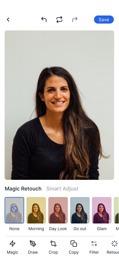
  • Customizable Workspace: Users can customize their workspace to suit their editing workflow, improving efficiency and user satisfaction.
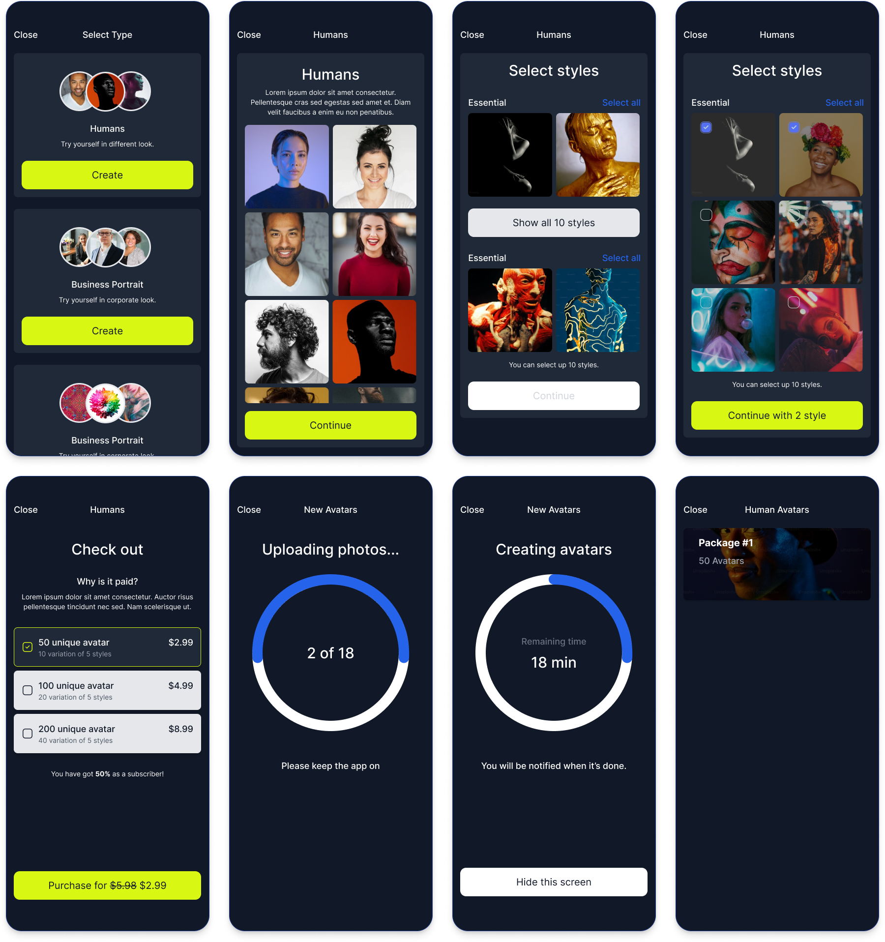
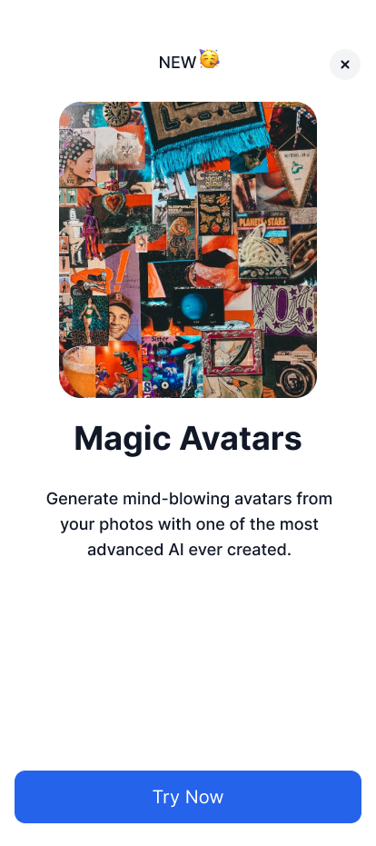
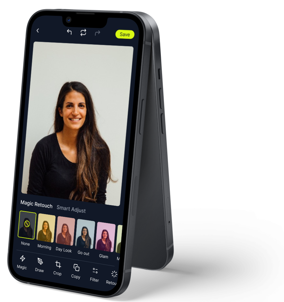
  • Magic Package: A unique feature of Lenstart is the “Magic Package,” available for purchase within the app. This package offers advanced editing tools and filters, enabling users to take their photo editing to the next level.

Font & Typography

We use Inter as primary typeface. The hierarchy is divided in three parts: headings, bold and regular body styles. There's also a paragraph style with larger font size and line-height.

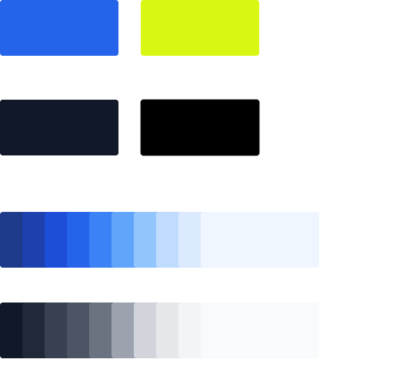
Colors

We use Inter as primary typeface. The hierarchy is divided in three parts: headings, bold and regular body styles. There's also a paragraph style with larger font size and line-height.

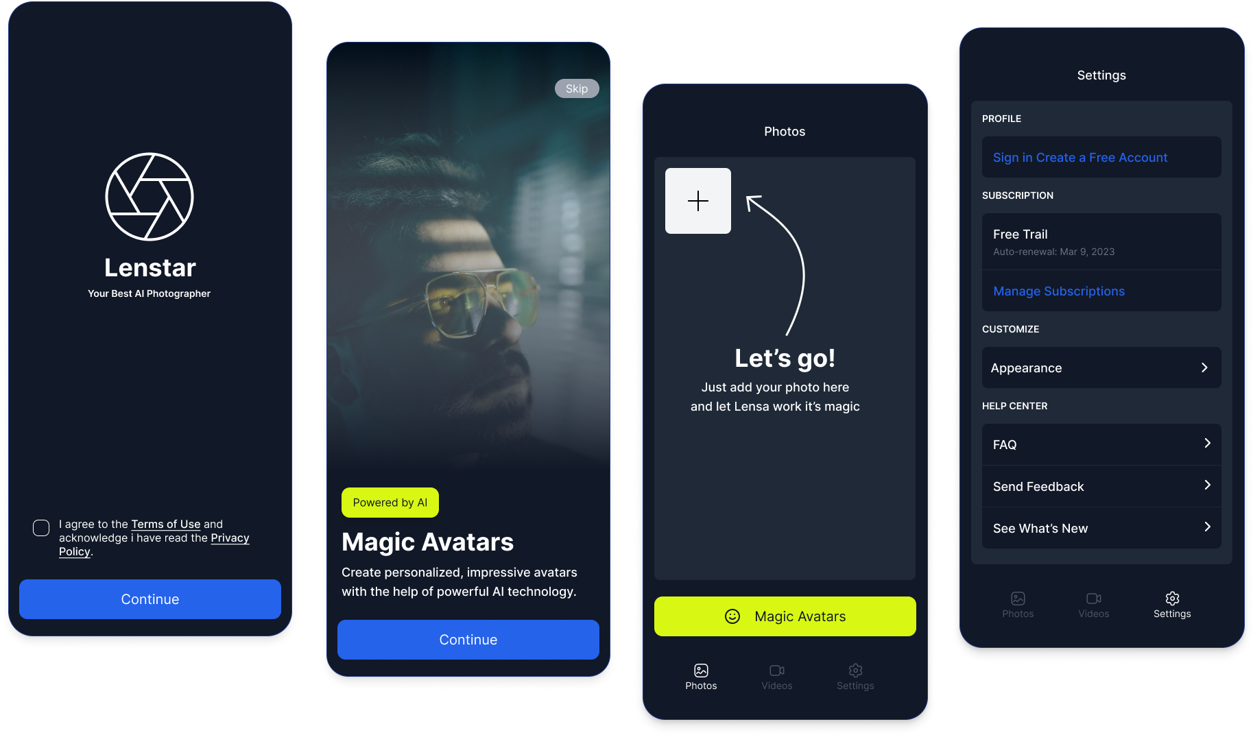
Onboarding

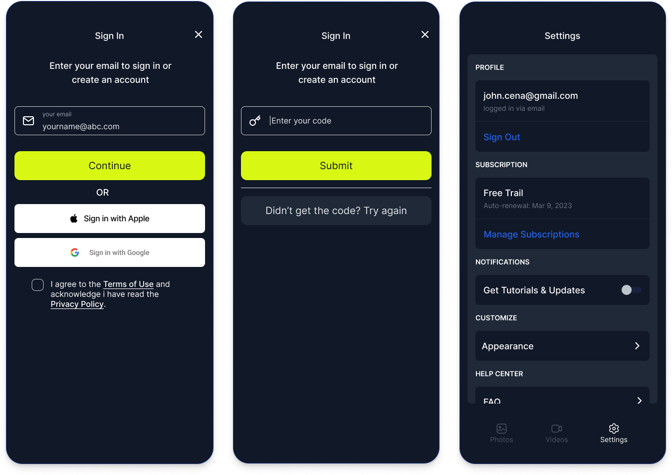
Sign In / Registration

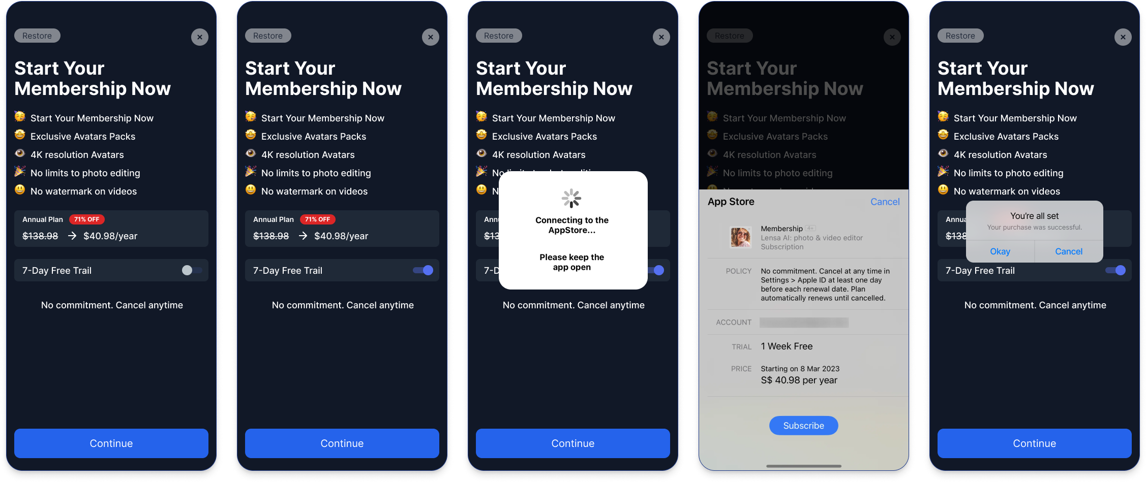
Subscription

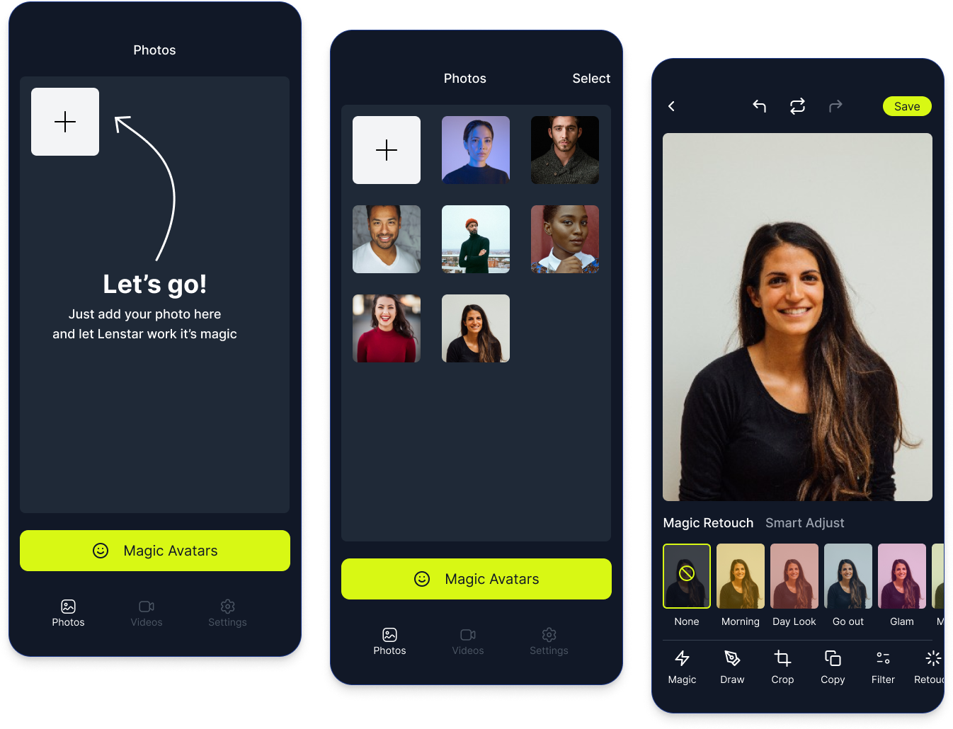
Photo editing

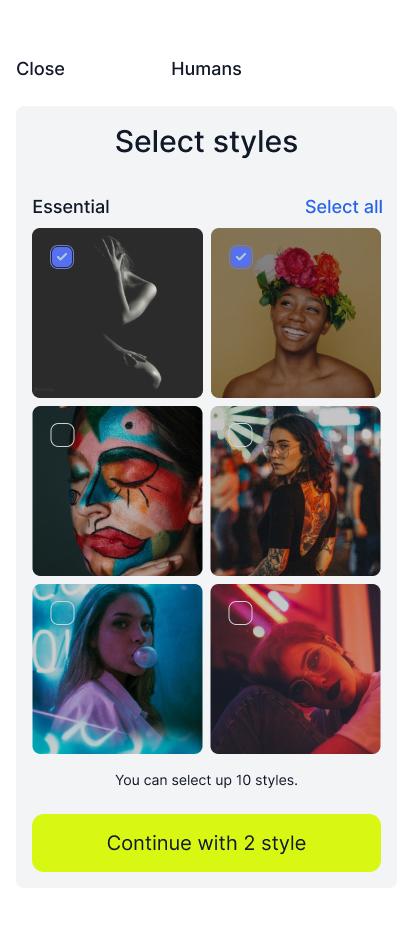
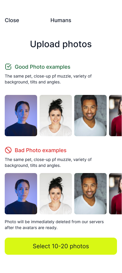
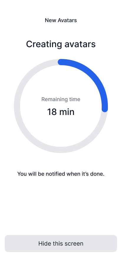
Magic Bundle and AI Editing

Collaboration and Feedback

Throughout the design process, we maintained a close collaboration with the research team, gathering user feedback on our prototypes. This iterative feedback loop was instrumental in refining the app's features and usability, ensuring that Lenstart met the real needs of our users.

Conclusion

The development of Lenstart was a journey marked by collaboration, innovation, and a deep understanding of our users' needs. By leveraging the strengths of Figma and Photoshop, we were able to create an app that is not only powerful and versatile but also intuitive and accessible. Lenstart stands as a testament to the importance of user-centered design in creating software that truly resonates with its audience.
Back

Do you want to discuss career opportunity? Email me at Contact@mehulmunjani.com

Download Resume