May 3, 2015

Space-O Technologies

Task

Space-O Technologies, a prominent player in web and mobile app development, sought a website redesign to enhance its online presence and better showcase its expertise and services. As the lead UX/UI designer on the project, my role was to revamp the website to align with modern design trends, improve user experience, and ultimately drive engagement and conversions.

  • Strategy

    UX Research

  • Design

    UI/UX Design, Responsive Design

  • Client

    Space-O Technologies

  • Tools & Technologies

    Adobe Photoshop, Adobe XD, Wordpress, HTML/CSS3

  • Duration

    6-9 Months

Open Project

Collaboration and Stakeholder Engagement:

Collaboration was key to the success of this project. I worked closely with Space-O Technologies' marketing team, developers, and key stakeholders to understand their vision, goals, and pain points. Regular meetings and feedback sessions ensured alignment throughout the design process.

Goals and Problem Statements

Modernization

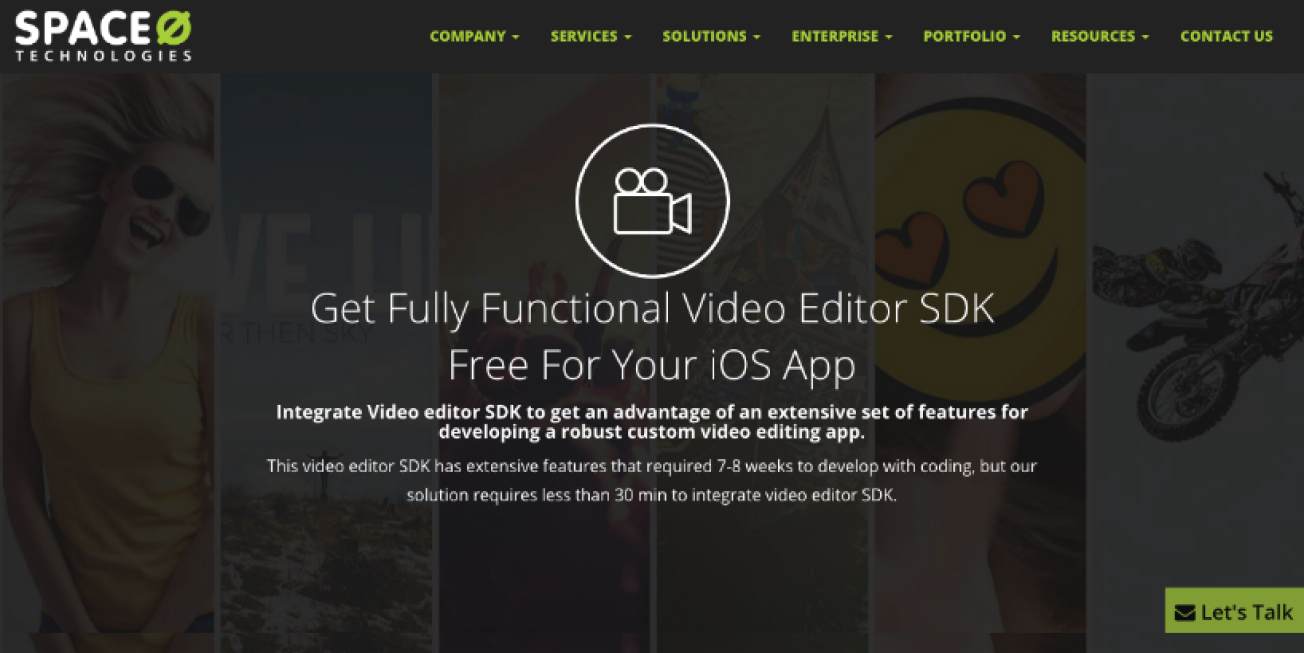
The existing website felt outdated and did not reflect Space-O Technologies' innovative approach to app development.

Improved Navigation

Users struggled to find relevant information due to complex navigation and cluttered content.

Mobile Responsiveness

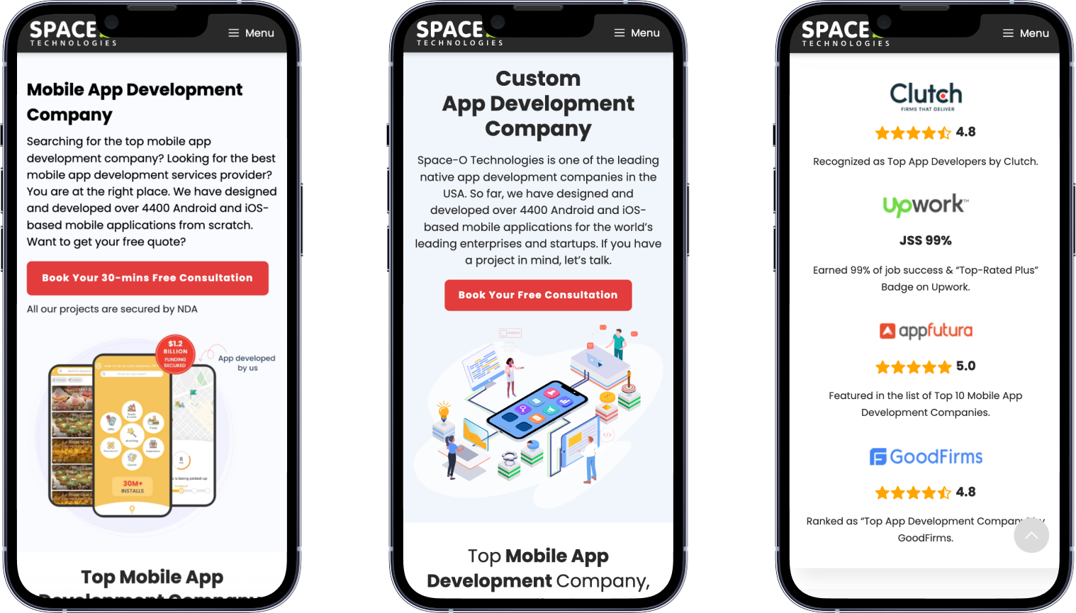
With an increasing number of users accessing the website on mobile devices, it was crucial to ensure a seamless experience across all screen sizes.

Research and Analysis

  • User Research: Conducting in-depth user research helped us uncover the needs, preferences, and behaviors of Space-O Technologies’ target audience. We conducted surveys, interviews, and usability tests to gather valuable insights.
  • Persona Development: Based on our research findings, we created user personas representing different segments of Space-O Technologies’ audience. This exercise enabled us to tailor the redesign to meet the specific needs of each persona.
  • User Journey Mapping: Mapping out the user journey from landing on the website to completing desired actions allowed us to identify pain points and opportunities for optimization. This guided our decision-making process throughout the redesign.

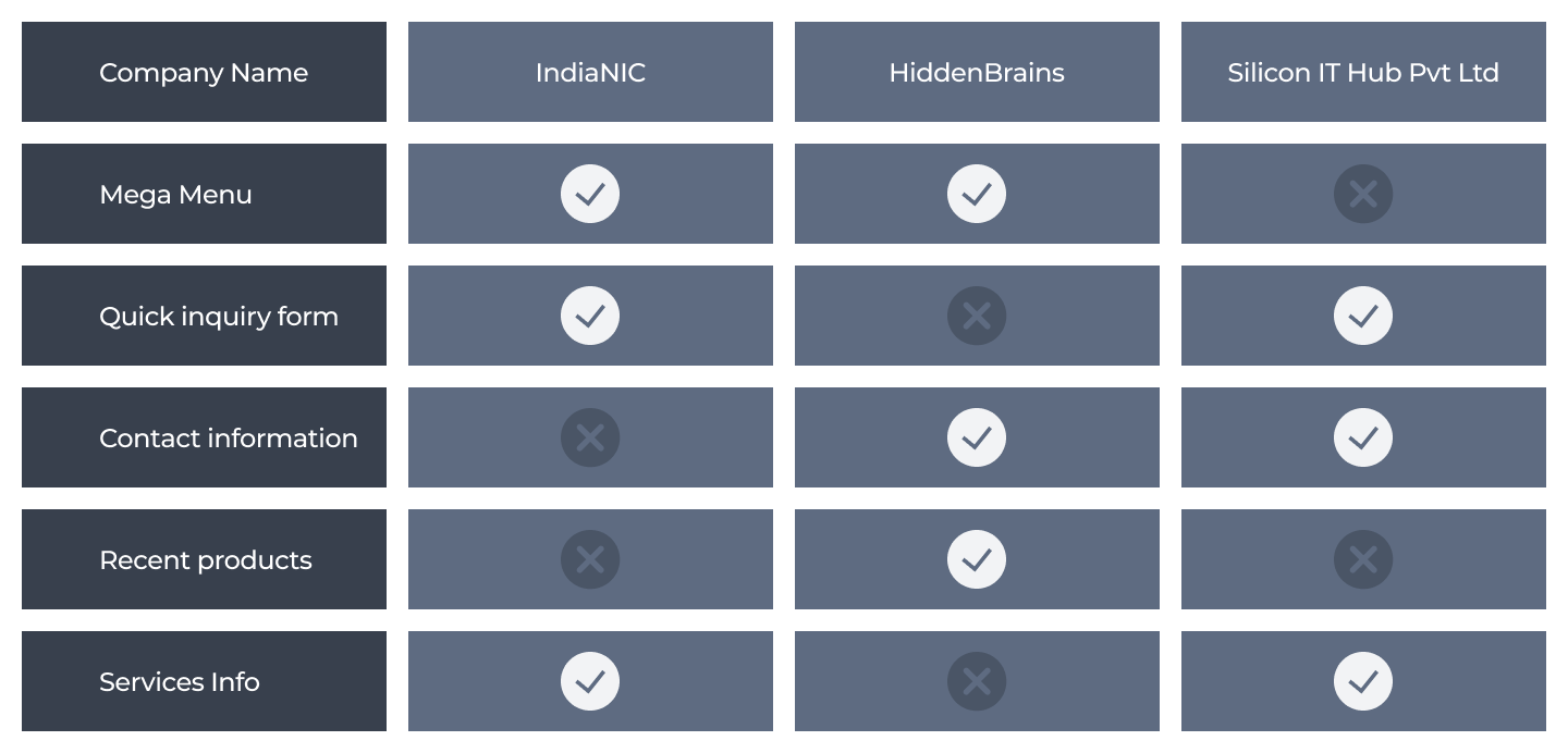
Competitive Analysis

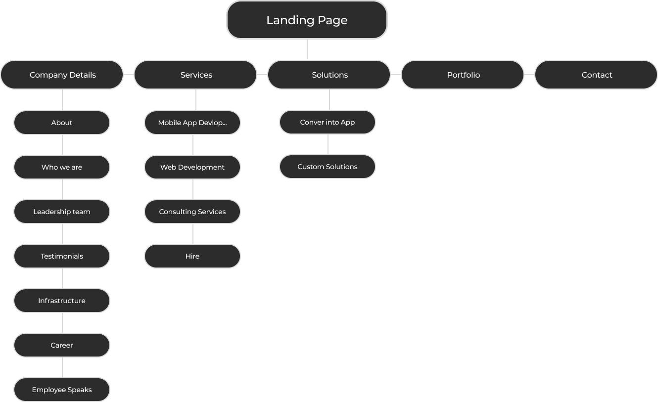
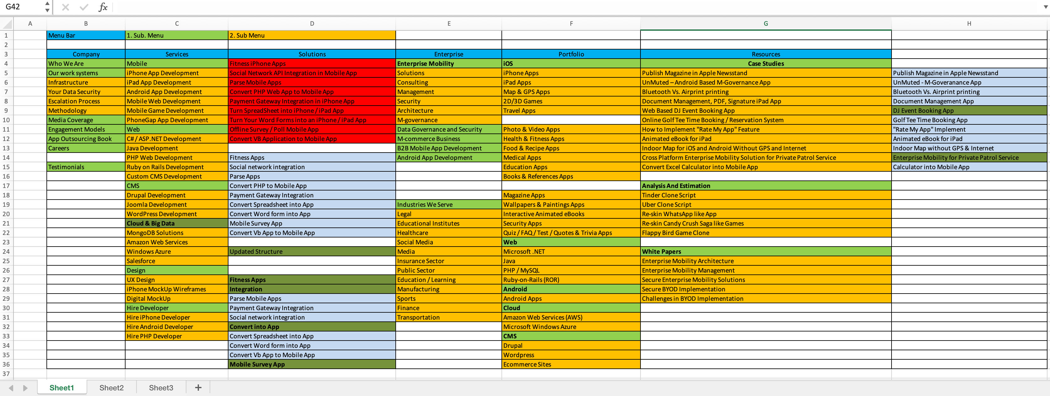
Site Map

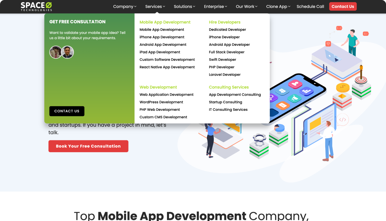
Final Navigation Menu Information

Design Process

Step 1.

Wireframing

We started with low-fidelity wireframes in Adobe XD to outline the basic structure and layout of the new website. This phase focused on functionality and content hierarchy.

Step 2.

Prototyping

Developing interactive prototypes allowed us to visualize user interactions and test navigation flow. Iterative prototyping helped us refine the user experience and address usability issues.

Step 3.

Visual Design

Transitioning from wireframes to high-fidelity designs using Adobe XD and Photoshop, we incorporated Space-O Technologies' branding elements while introducing a fresh and modern look. Attention to detail was crucial to ensure consistency across all pages.

Step 4.

Iterative Design

Throughout the design process, we collaborated closely with stakeholders and solicited feedback from users through usability testing sessions. Iterative refinements were made based on this feedback to ensure the final design met both business objectives and user needs.

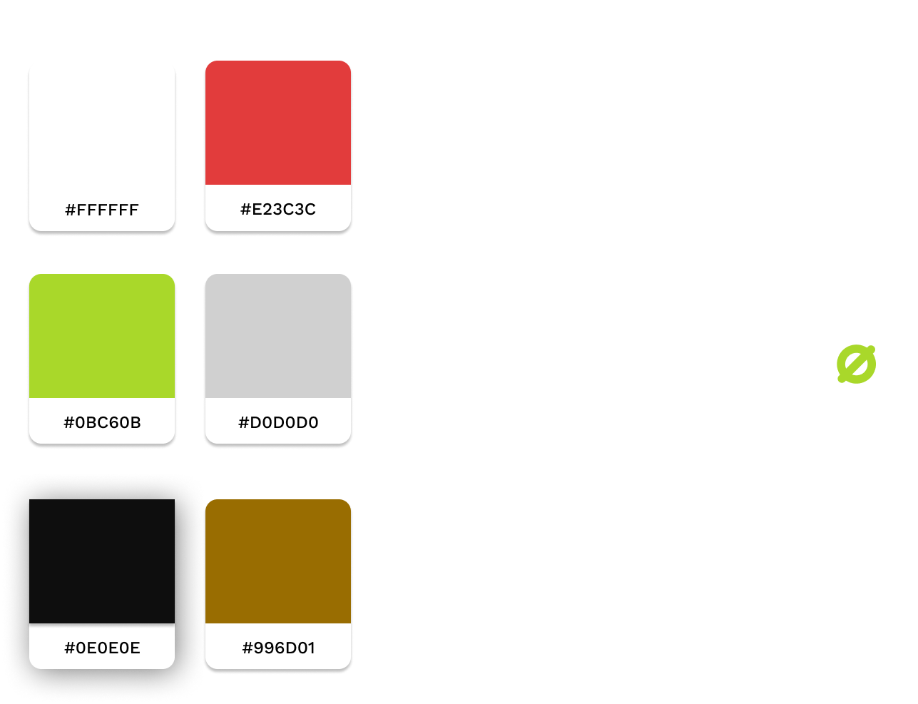
Style Guide

Unique Features

80+ Different Sections Style

Unique sections
pages & patterns.

To save time and make every page looks different, we created almost 80+ different-looking sections, so while creating the layout we focus more on user experience.

Mobile Friendly

Responsive design.
Bootstrap backend.

Design that stands out on mobile, Code that is easy to use and quick to load in the mobile browser.
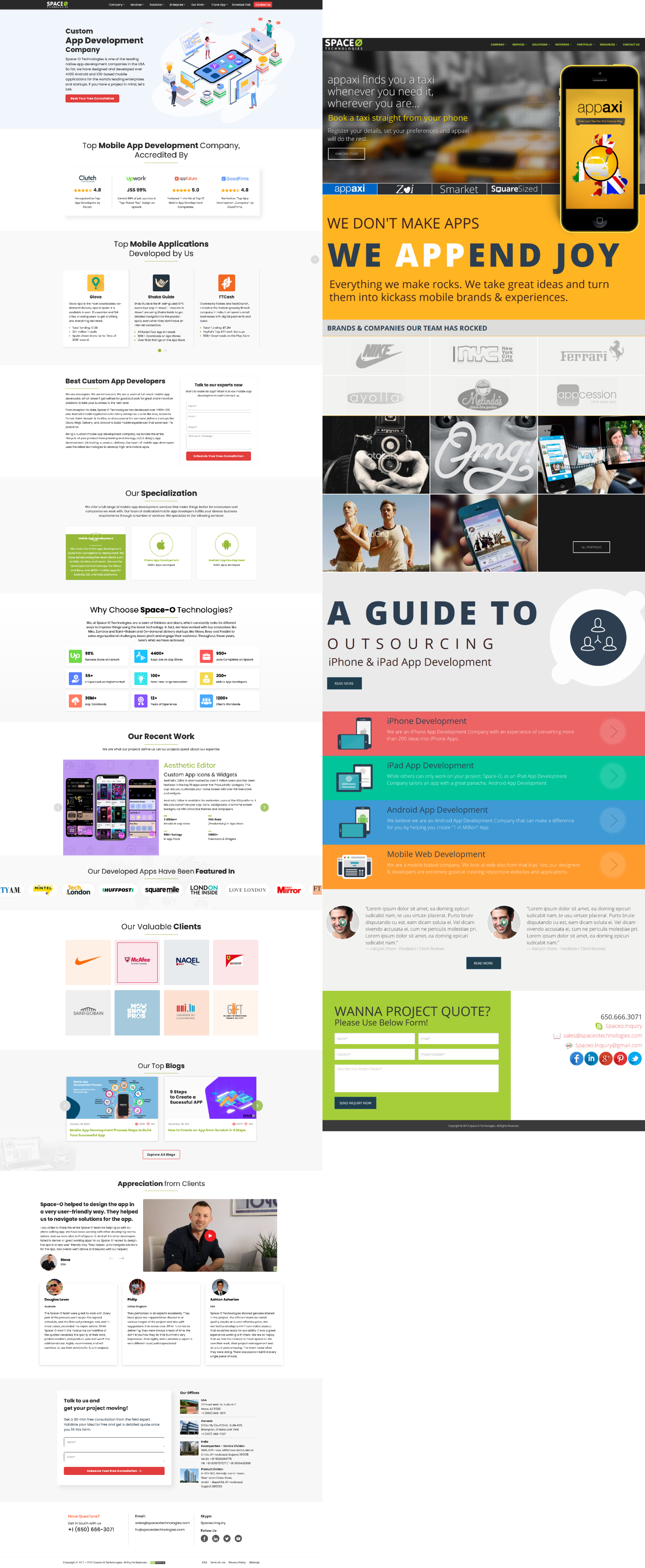
Before/After

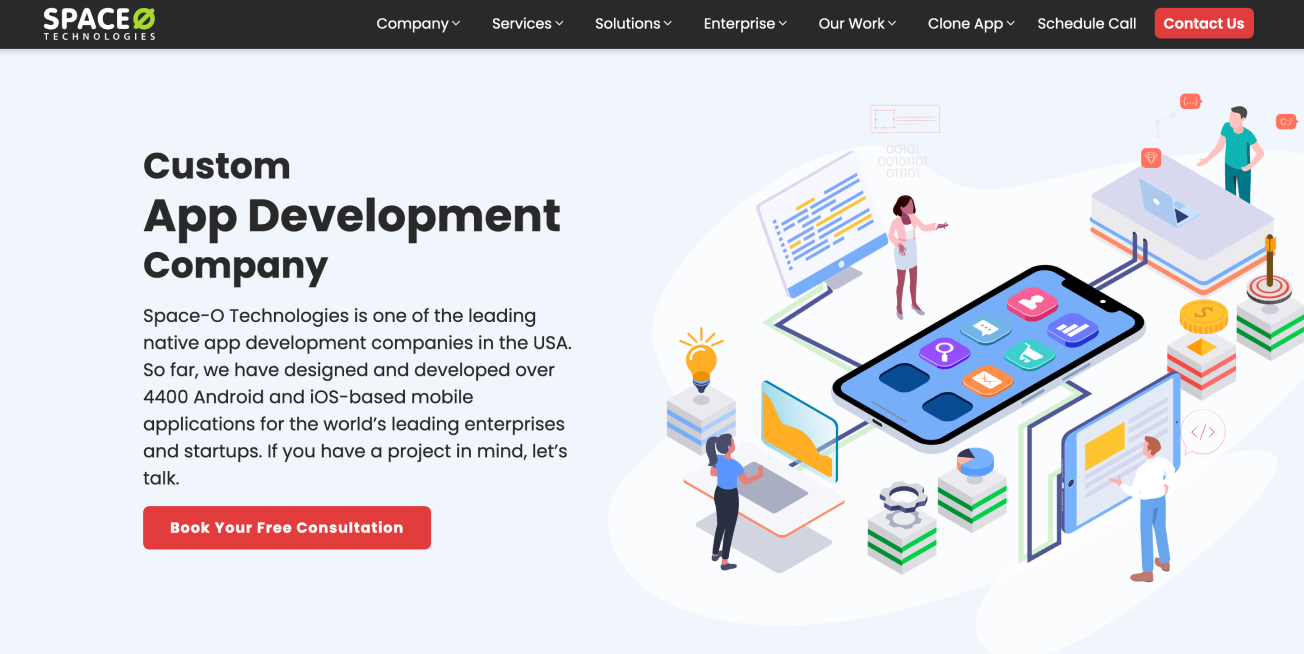
Before After

Mockup

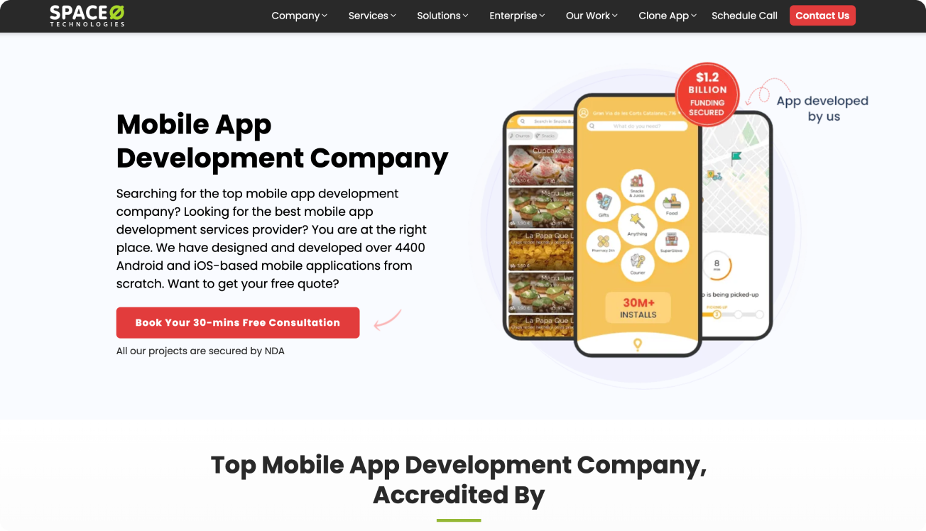
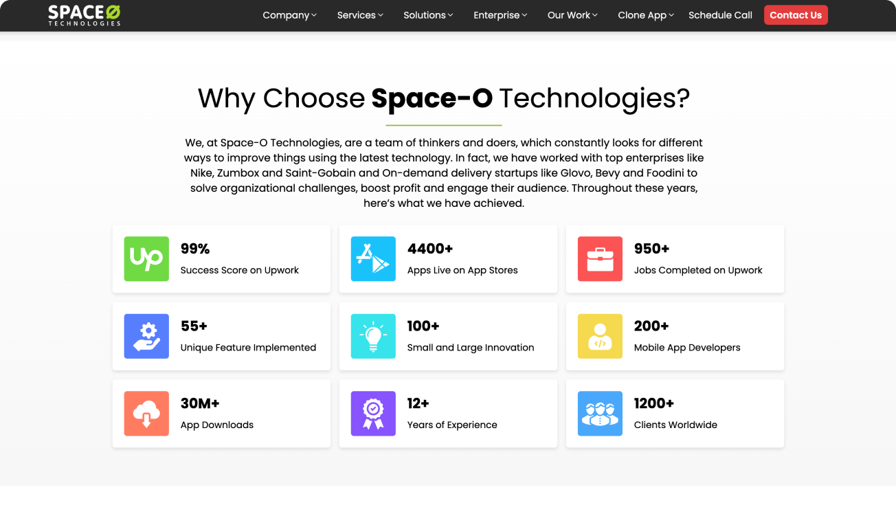
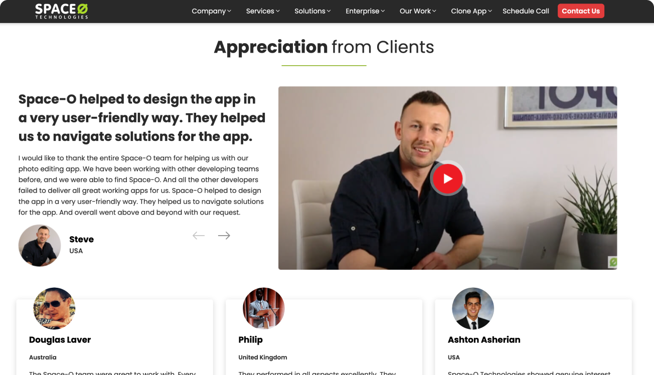
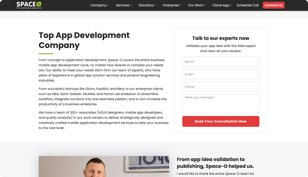
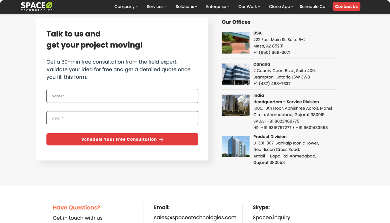
Final Design

Results

  • The redesigned Space-O Technologies website successfully addressed the pain points identified in the previous iteration.
  • Improved navigation and streamlined content structure enhanced the overall user experience, resulting in increased engagement and longer session durations.
  • Mobile responsiveness was significantly improved, catering to the growing number of users accessing the website on smartphones and tablets.
  • Positive feedback from users and stakeholders validated the success of the redesign in meeting its objectives.

Conclusion

The redesign of the Space-O Technologies website was a collaborative effort guided by thorough research, analysis, and iterative design. By focusing on user needs and industry best practices, we created a platform that not only reflects Space-O Technologies’ industry leadership but also provides a seamless and enjoyable experience for visitors. The project highlights the importance of user-centric design principles in achieving business goals and fostering positive user engagement.

Thank you!

Thank you for taking the time to review my case study. If you would like to see more or get in touch, please fill out the information provided below.


    Back

    Do you want to discuss career opportunity? Email me at Contact@mehulmunjani.com

    Download Resume