Amazon Prime Mobile app Redesign
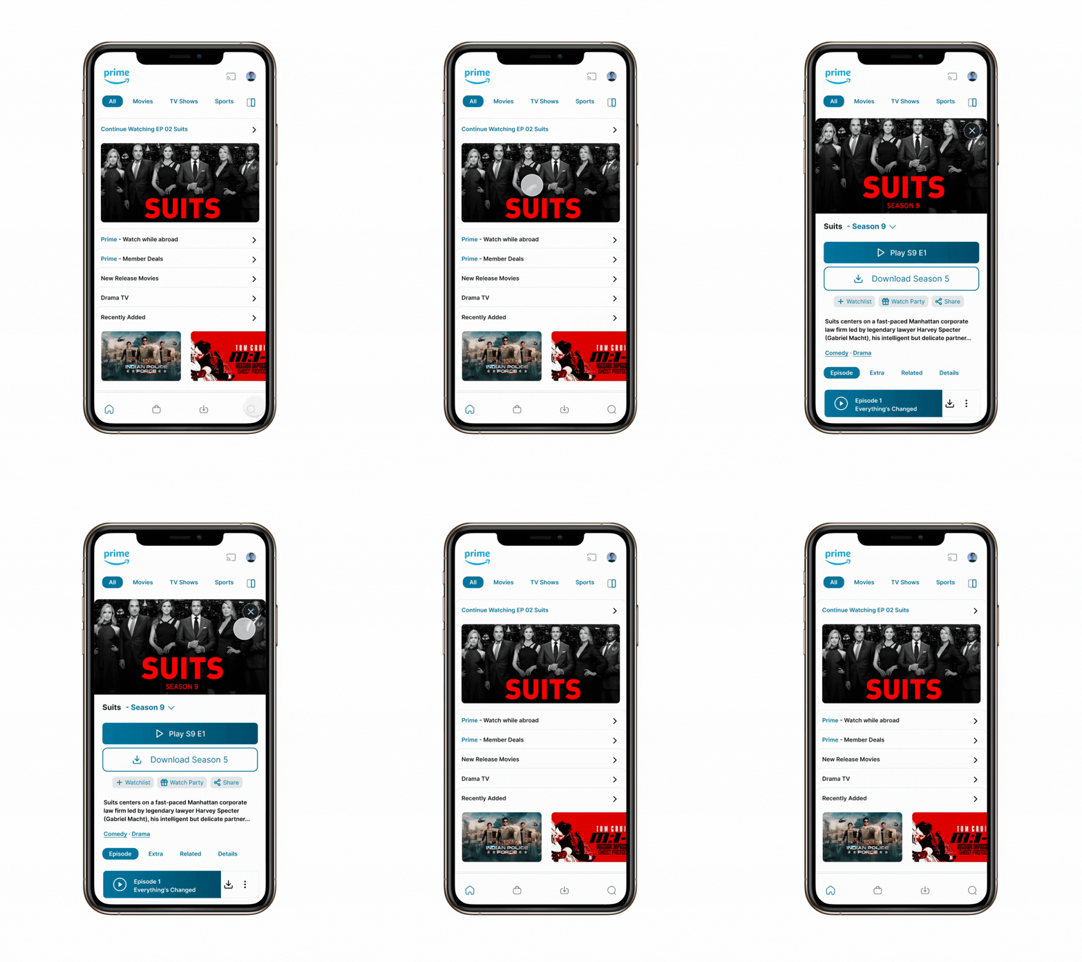
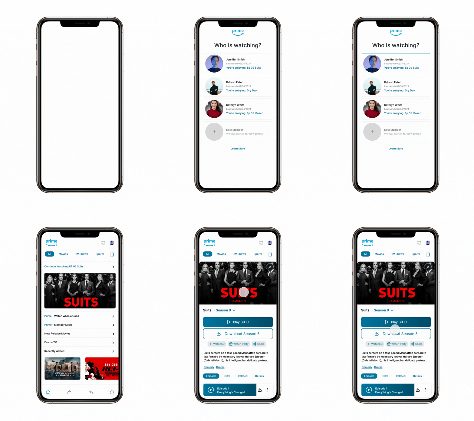
The primary goal of this redesign was to enhance the user experience of the Amazon Prime mobile app, focusing on the splash screen, profile screen, home screen, and detail screen. The aim was to create a more engaging, intuitive, and visually appealing interface that encourages user interaction and content discovery.
Task
Redesign the Amazon Prime mobile app experience

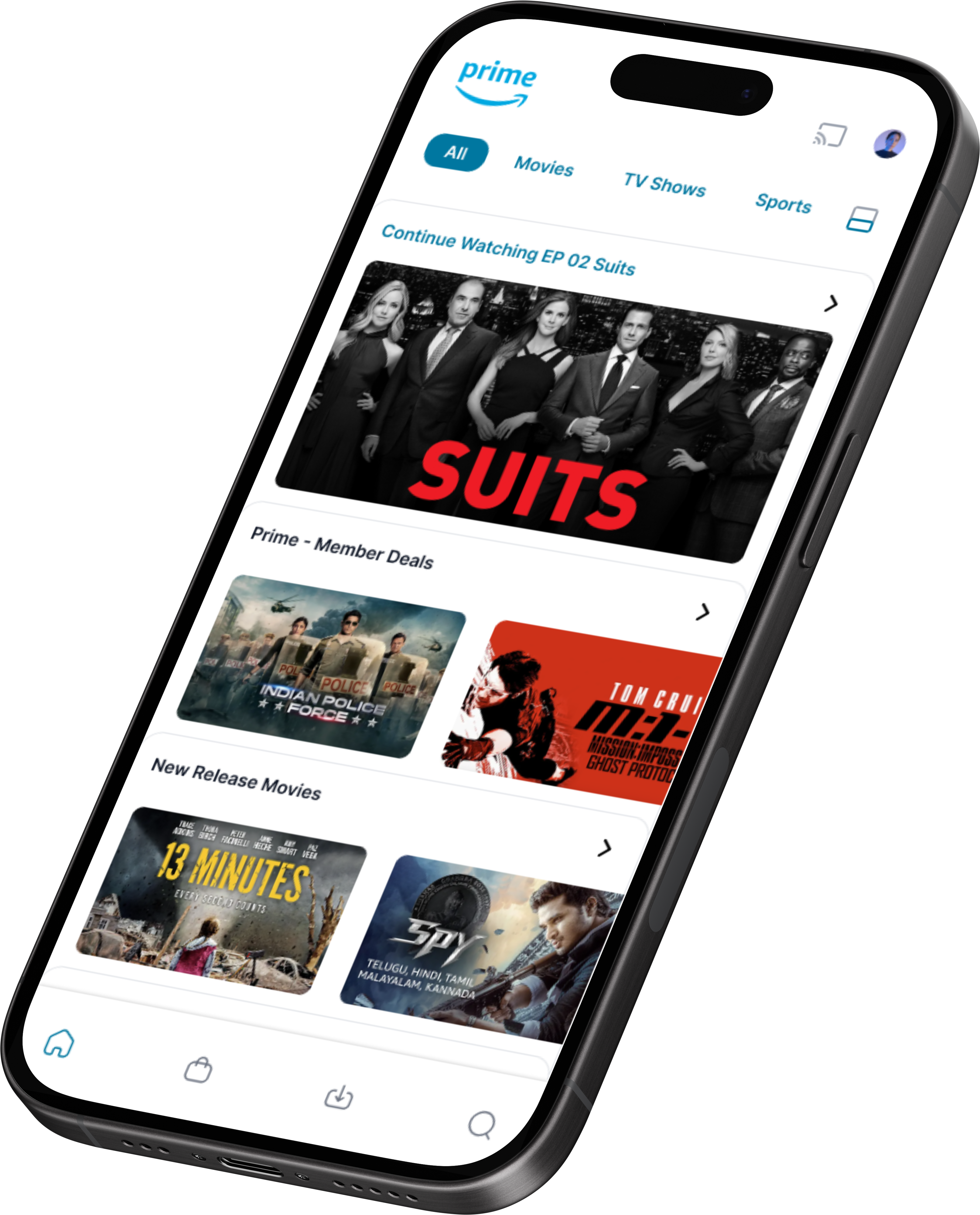
The primary goal of this redesign was to enhance the user experience of the Amazon Prime mobile app, focusing on the splash screen, profile screen, home screen, and detail screen. The aim was to create a more engaging, intuitive, and visually appealing interface that encourages user interaction and content discovery.
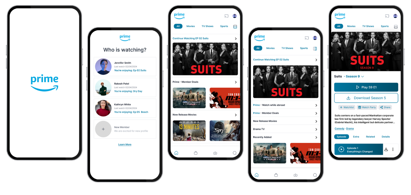
- Objective: Create a welcoming first impression that loads quickly and smoothly transitions to the main content.
- Design Decisions: We opted for a minimalist design featuring the Amazon Prime logo against a dynamic background that changes based on the user’s viewing history, making each experience unique from the moment the app is launched.
- Impact: This approach sets a positive tone for the user experience, emphasizing personalization and a seamless transition into the app.
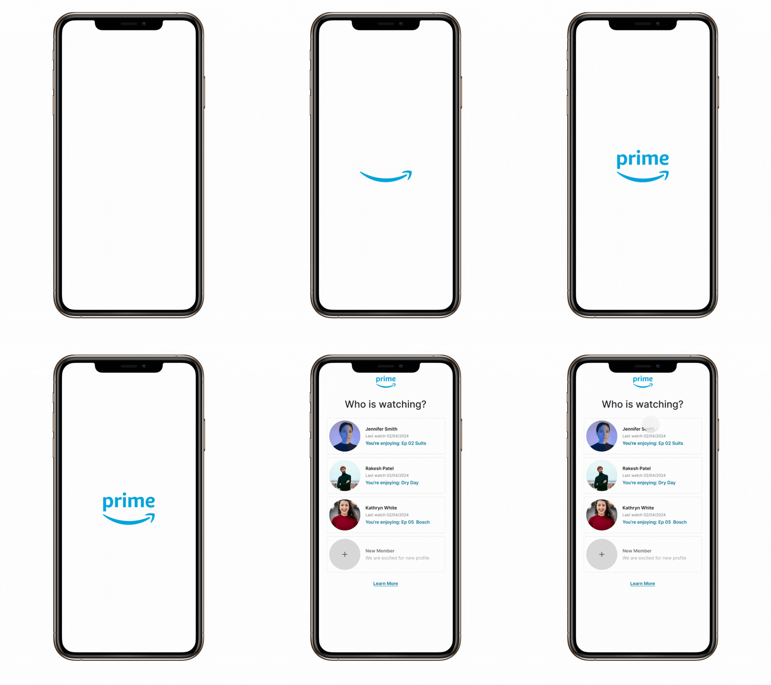
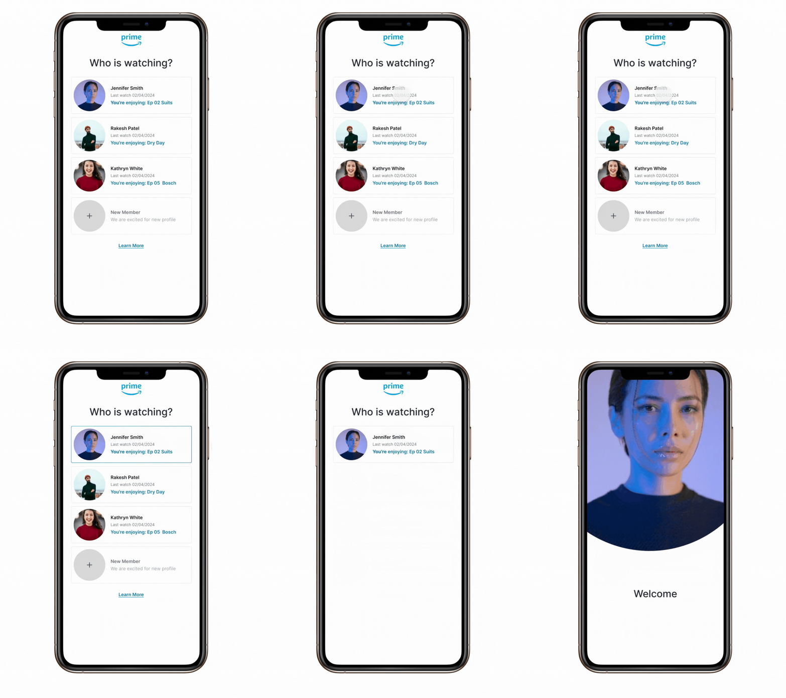
- Objective: Allow users to easily manage their accounts and settings, and introduce a more personalized content recommendation system.
- Design Decisions: The redesigned profile screen features a clear, easy-to-navigate layout with direct access to account settings, viewing history, and personalized recommendations. We incorporated user avatars for a more personalized touch and to facilitate easy switching between profiles.
- Impact: This redesign makes the app more user-friendly and personal, encouraging longer engagement times by making content discovery more intuitive.
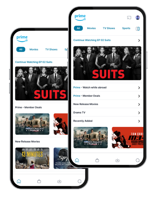
- Objective: Improve content discoverability and streamline the navigation process.
- Design Decisions: The home screen was reorganized to prioritize content discovery through a personalized recommendation feed based on viewing habits.
- Impact: These changes have made it easier for users to find new content they love, reducing decision fatigue and enhancing the overall user experience.
- Objective: Provide users with all the information they need to decide whether to watch a movie or series, and encourage content exploration.
- Design Decisions: The detail screen now includes a more comprehensive overview, including trailers, cast information, similar titles, and user reviews, all accessible without scrolling. We also introduced an interactive element where users can swipe through similar titles.
- Impact: This redesign has led to an increase in content exploration and a higher rate of content consumption, as users can easily access all the information they need to make viewing decisions.
